|
kwakkie
|
 |
« Reply #440 on: March 09, 2011, 02:34:59 AM » |
|
Nice work Willy!  |
|
|
|
|
 Logged
|
|
|
|
|
MegaLeon
|
|
« Reply #441 on: March 09, 2011, 05:20:12 AM » |
|
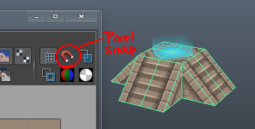 NOTE: ONLY USE THIS ON ONE UV POINT AT A TIME, MOVING MORE THEN ONE AT A TIME WILL COLLAPSE ALL POINTS INTO ONE. YES! That did the trick. Many thanks, willy! It works only when I assign a texture to the material. So what I do now is assigning a black texture with the same size as the texture I plan to use, edit the UV with pixel snap, draw the actual texture and replace the black one. What do ya think? |
|
|
|
|
Logged
|
|
|
|
Pixelgent
Level 1

Pixels and Polygons


|
|
« Reply #442 on: March 09, 2011, 01:14:08 PM » |
|
that works an yea it has to have a texture or there will be nothing to snap to
|
|
|
|
|
Logged
|
|
|
|
|
Dugan
|
|
« Reply #443 on: March 10, 2011, 09:13:07 AM » |
|
an old wip of part of a space scene, I`ll update with the finished thing once i get my capture working. 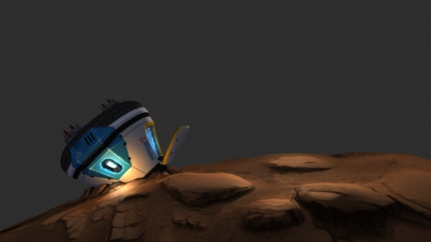 |
|
|
|
|
Logged
|
|
|
|
|
|
|
Linx
|
|
« Reply #445 on: March 12, 2011, 07:48:52 PM » |
|
I really need to learn how to 3d model. This thread is making me cry.
|
|
|
|
|
Logged
|
|
|
|
|
caffeine
|
|
« Reply #446 on: March 15, 2011, 06:14:13 AM » |
|
Third time's the charm 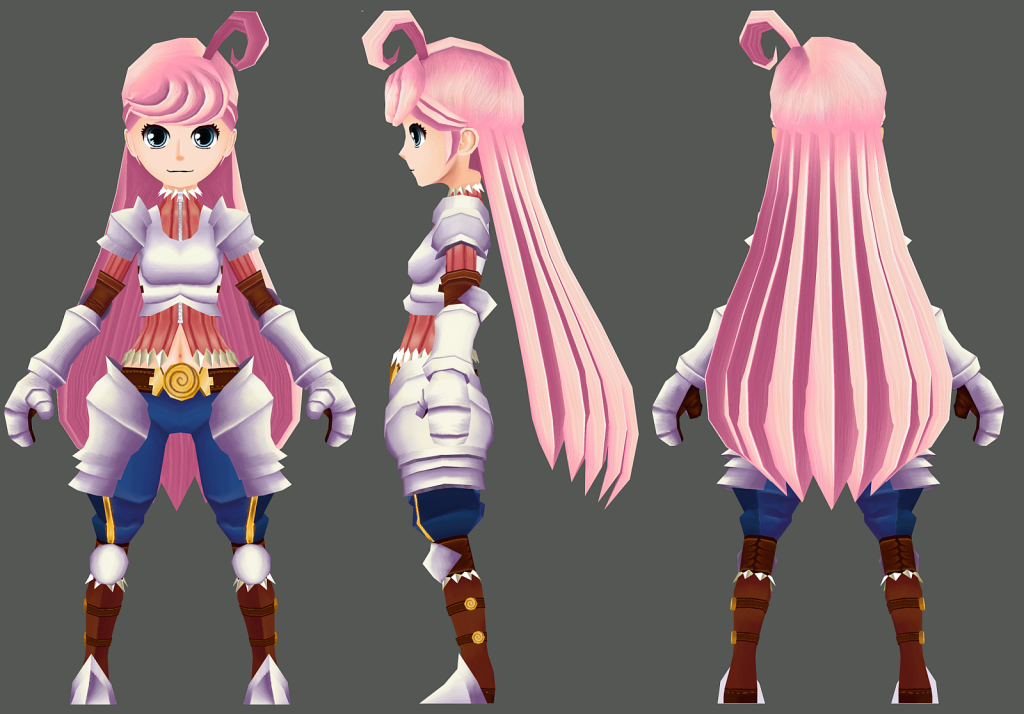  This is looking great man, that's all. |
|
|
|
|
Logged
|
|
|
|
|
Kevin
Guest
|
|
« Reply #447 on: March 15, 2011, 06:23:23 PM » |
|
pretty models and textures
I think the breasts in the armorless model are over emphasized or something. Her shirt looks like it's form fitted to her body, like spandex more than the knitted fabric the texture implies. Can I suggest something like this?:  The idea being to make it look like the fabric slopes down gradually under her chest, and stretches over the separation between her breasts. This is a 2 minute, mouse-drawn paintover so it's a little rough, to put it mildly, but I think it illustrates what I'm trying to say well enough. Come to think of it, my edit still looks too form fitted. The shadow under her chest should probably be closer to a straight line (where as right now it sort of curves up too much between the breasts). |
|
|
|
|
Logged
|
|
|
|
|
Adamski
|
|
« Reply #448 on: March 15, 2011, 06:51:56 PM » |
|
To me, her eyes seem kinda harsh for her pink/girly design.
|
|
|
|
|
Logged
|
|
|
|
|
Chris Pavia
Guest
|
|
« Reply #449 on: March 15, 2011, 09:17:34 PM » |
|
I think the breasts in the armorless model are over emphasized or something. Her shirt looks like it's form fitted to her body, like spandex more than the knitted fabric the texture implies. Can I suggest something like this?:
The idea being to make it look like the fabric slopes down gradually under her chest, and stretches over the separation between her breasts. This is a 2 minute, mouse-drawn paintover so it's a little rough, to put it mildly, but I think it illustrates what I'm trying to say well enough. Come to think of it, my edit still looks too form fitted. The shadow under her chest should probably be closer to a straight line (where as right now it sort of curves up too much between the breasts).
Listen to this man. Cloth and drapery can be pretty tough, I have a hard time with it myself. Reference is key! |
|
|
|
|
Logged
|
|
|
|
|
Theophilus
Guest
|
|
« Reply #450 on: March 17, 2011, 02:41:48 PM » |
|
The texture didn't work quite right, so here's just the naked model.  It's a hammer! |
|
|
|
|
Logged
|
|
|
|
|
ink.inc
Guest
|
|
« Reply #451 on: March 17, 2011, 08:30:16 PM » |
|
It's a hammer!
 |
|
|
|
|
Logged
|
|
|
|
|
pixhead
Guest
|
|
« Reply #452 on: March 17, 2011, 09:31:15 PM » |
|
^^ Good sir, you win  |
|
|
|
|
Logged
|
|
|
|
|
Bree
|
|
« Reply #453 on: March 18, 2011, 08:51:06 AM » |
|
I made a palm tree. :D  |
|
|
|
|
Logged
|
|
|
|
|
Μarkham
|
|
« Reply #454 on: March 18, 2011, 12:39:18 PM » |
|
To me, her eyes seem kinda harsh for her pink/girly design.
Yeah, I think it would fit the style more if the outer black ring around the iris was removed. |
|
|
|
|
Logged
|
|
|
|
|
Tycho Brahe
|
|
« Reply #455 on: March 18, 2011, 06:23:49 PM » |
|
To me, her eyes seem kinda harsh for her pink/girly design.
Yeah, I think it would fit the style more if the outer black ring around the iris was removed. Tbh, I kinda like it, it adds a level of baddasery that the character very much needs. |
|
|
|
|
Logged
|
|
|
|
|
Bree
|
|
« Reply #456 on: March 19, 2011, 11:34:52 AM » |
|
Update on vegetation: changed the palm tree leaves to be more three-dimensional, added some ferns and other things.  |
|
|
|
|
Logged
|
|
|
|
|
McMutton
|
|
« Reply #457 on: March 21, 2011, 02:29:53 PM » |
|
I'm liking the style you've got there, Theo. Nice work! Right, I've tabulated everyone's opinion, and decided that I'm keeping the iris rings. But only 'cause I'm lazy. Anyway, pillars! 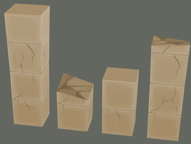 |
|
|
|
|
Logged
|
|
|
|
|
Halcyon
|
|
« Reply #458 on: March 21, 2011, 11:21:22 PM » |
|
The pillars are nice, but I can't help but think that the colour makes them look like cardboard boxes stacked on each other.. with cracks. Also I am not sure if you are going for a cartoonish style or not, but you could add a lot with using normal maps to add extra detail. And here is something I had been working on for a little while, I present to you MOHAWK CHICKEN:  I have no idea how I would go about texturing it. |
|
|
|
« Last Edit: March 22, 2011, 05:55:37 PM by Halcyon »
|
Logged
|
|
|
|
|
Saker
Guest
|
|
« Reply #459 on: March 21, 2011, 11:48:58 PM » |
|
Haven't done 3D for a long time now :\ here's some old stuff   |
|
|
|
|
Logged
|
|
|
|
|
 Developer
