Welcome, Guest. Please login or register.

Login with username, password and session length

 
Advanced search

1412073 Posts in 69447 Topics- by 58484 Members - Latest Member: bigdog243

June 25, 2024, 07:06:23 PM

Need hosting? Check out Digital Ocean
(more details in this thread)
TIGSource ForumsCommunityDevLogsCogmind (sci-fi robot-themed roguelike) - BETA RELEASED
Pages: 1 ... 22 23 [24] 25 26 ... 71
Print
Author Topic: Cogmind (sci-fi robot-themed roguelike) - BETA RELEASED  (Read 241945 times)
Kyzrati
Level 10
*****


View Profile WWW
« Reply #460 on: February 08, 2015, 05:55:23 PM »

Really really excited to play an alpha release!
Really excited (and tiring...) to get it out there!

Seriously awesome art style.

Really keeps the focus on all the cool parts of mech sim stuff like energy and systems.

Not really a fan of the genre, but I would play this.
I like hearing that :D.

And it's interesting you mention the idea of a "mech sim," which might be the first time anyone's made that connection. Coincidentally, the only influence I cited when creating the prototype was BattleTech, of which I'm a huge long-time fan :D. The gameplay is quite different since you frequently have to rebuild yourself from scrap, but the idea of energy and heat management, along with combining parts in an effective manner, are of course central to the game. That's the core game around which the prototype/7DRL was designed--everything else is supplementary.
Logged

Kyzrati
Level 10
*****


View Profile WWW
« Reply #461 on: February 11, 2015, 04:34:50 PM »

ASCII vs. Tiles

[Cross-posted from the devblog here--follow link for better formatting and light-on-dark style.]


Ah, a visual dichotomy not nearly as old as roguelikes themselves, but nonetheless of great significance today.

While a game's visual style need not always be rooted in its underlying mechanics (especially the case with traditional turn-based roguelikes), the choice between an ASCII or tileset map representation obviously has a major impact on the experience. And that impact occurs at a deeper level than "oh this looks better than that," affecting even the efficiency and precision of decision-making itself. Not that any individual preference for ASCII or tilesets is right or wrong, or one is inherently better in every way. Each representation has benefits and drawbacks, and to suit all types of players many popular roguelikes have the option of using either, as will Cogmind.


The Good and the Less Good
This discussion doesn't seem entirely necessary given that Cogmind will be both ASCII- and tileset-enabled, but the topic also serves as a background against which to explain the choice for Cogmind's primary tileset.

So what's so good about ASCII?

We can't look to roguelike origins for the answer, since early usage was born of limitation rather than free choice. To an extent we can attribute ASCII's modern relevance to tradition, continuing to use it because those who came before did the same. But the choice to use ASCII (as now it is a choice) must be more meaningful than that, because traditions that have lost their meaning tend to die out to be replaced by more meaningful approaches.

It turns out ASCII is actually quite practical, with a number of inherent benefits that are difficult or even impossible to replicate with a regular tileset.

Certainly ASCII's purely symbolic approach appeals to players who enjoy experiences more reliant on the imagination, but that feature is more a factor of personal preference. Here I'm interested in comparing the technical qualities of ASCII vs. tilesets that can be used to inform the tileset selection process. From another perspective, simple symbolic glyphs help distill information for tactical decision-making into its purest form--i.e. with no "superfluous visual distractions." In that respect my initial vision for a future tileset when starting Cogmind was something akin to "icons" in their simplicity.

ASCII also benefits from the fact that we can leverage years of experience distinguishing a very specific set of symbols to identify them even when densely clustered and/or at small sizes. Our eyes are already well-trained to parse alphanumeric information--all that's required is learning to associate symbols with specific objects. After learning those associations, visual information can be absorbed both quickly and with a very low chance of error. This is even possible using ASCII fonts only 7~9 pixels tall.

Tilesets simply cannot do this to the same degree of readability, so our "training" obviously has its advantages. Unfortunately that benefit is at the same time ASCII's biggest disadvantage. Those years of training also apply to the glyphs' meanings, which we must re-associate with a new meaning in the context of a game. Many players have difficulty making that conceptual leap, preferring instead to associate new meanings with new representations (or in many cases representations based on similar previous representations that are already familiar for that same object--e.g., a drawing of an orc rather than an 'o').


A comparison of Dungeon Crawl: Stone Soup ASCII vs. tiles mode (a similarly crowded but not identical scene). Assuming you know what the symbols represent, the ASCII here is far clearer despite showing 50% more creatures, and doing so with less space overall. As an aid for beginners, a symbol key is provided at the side of the ASCII window (not shown).

Interestingly, the process of learning and using a new tileset is somewhat the opposite of ASCII: the association step is fairly easy, while differentiation can be more time consuming, especially when dealing with numerous smaller pixel sprites.

In the above DCSS example, without help or experience we have little idea what those letters mean, while we can pretty easily guess what most everything is in the tiles version. However, it is highly likely that anyone equally familiar with both systems will take a moment longer to read the entire situation on the right compared to taking in most of the information provided by the ASCII. The difference might be mere milliseconds, but that processing time adds up with every turn, more so when taking actions quickly and many creatures are moving around.

At least the tiles are fairly large at 32x32--the smaller the tiles the greater the lag, while ASCII doesn't suffer that same problem.

Of course, compared to the task of parsing and differentiating tiles, associating letters and numbers with objects is generally harder because it is less based on prior knowledge (roguelike ASCII conventions aside), thus the average player will always choose to play with a tileset.

Tiles also have the benefit of increased pixel space and freedom to convey more information than ASCII, and a well-designed tileset can overcome many of the readability issues, or at least make up for them in other ways. In any case, unless they're incredibly simple (e.g., not DCSS tiles) they still can't beat the readability of alphanumeric glyphs displayed against a solid black background.

In that context, let's analyze some Cogmind tileset concepts...


Tileset Concepts, in Game
I took the most complete and promising concepts originally submitted here, and dropped them into the game to see what they look like in action. This is an opportunity to see them in color as well as how they work together as a whole. Some things to note:
  • None of these are the original submissions you saw in the tileset poll. They are subsequent updates based on feedback the artists received either from me directly or from reading my discussions about the art direction with other developers (it continues for about four pages, and gets increasingly detailed). I didn't ask that anyone provide additional samples, but each proactively updated their set to more closely match the style and needs of the game.
  • Don't bother comparing glyphs between different tilesets for what they are. The tileset concepts being only samples, in most cases there were not enough sprites to go around, so I sometimes simply applied sprites to completely unrelated robots or objects just to get them in the map for viewing.
  • The images below are small excerpts from possible scenes that can occur in game. The left side is from the beginning Materials floors; the right side is the Factory. (7DRL players will remember the names of these areas, though their contents have changed significantly since then.)
  • Notes specific to some sets: Artist F provided no items, so they are all left blank (the empty spaces); Artist P provided only one item (a key, which actually doesn't exist in Cogmind), so I used that as a substitute for all items.

Cogmind tileset concepts, as they appear in game (click to open full size).

Assuming the goal is readability, we want something that shares the clearly defined and easily distinguishable shapes of ASCII. This implies a need for less detail, though we can retain some inner detail since the monochrome requirement helps make it more apparent where one object ends and another begins when in close proximity on the map. (Incidentally, regardless of the tileset, monochrome sprites reduce the map's visual noise overall, a useful feature that makes use of one of ASCII's inherent advantages.)

My analysis comes as 20/20 hindsight because honestly I didn't realize all this when advertising for an artist, otherwise I could've used the information to give applicants more guidance for their initial concepts. At the time I was still unfamiliar with the best practices of using a tileset that can mimic ASCII's look and feel, and was even unsure if that's what the ultimate goal was! I suppose this demonstrates the value of having concepts to analyze and draw conclusions from in the first place.

My take on each of the concepts above:
  • [A]: The original A concept looked great on its own, and was noticed by a good number of roguelike regulars commenting on the tilesets. However, there were some dissenting voices that this and other similarly shaded tilesets were not "Cogmind" enough. I'd have to agree. The revised "ASCII-fied" version reduces the shading and does seem more appropriate, but loses a good bit of its appeal as a result. Its heavily line-based appearance makes it more difficult to read individual objects on the map when bunched together, as lines tend to stream into one another in adjacent cells. The seamless blending of the Factory walls is excellent, though I think for Cogmind we'll probably be going with discrete wall segments.
  • [F]: The version of F shown above is completely different from the original concept, switching from what was a stylized version of my original 7DRL tileset to something more unique. Compared to other shaded tilesets, this one handles the shading better because it has more room to do so, using a surprisingly large number of the pixels for each robot (in many cases leaving no rows or columns completely empty). It has both detail and easily recognizable form. (Note that Factory wall might have been intended as a door, but I used it as a wall for now--overall the walls are less important where concept comparisons are concerned, because Cogmind's terrain is far simpler than other objects and doesn't require nearly as much variation.)
  • [L]: This is a contentious tileset. In its original form, which lacked shading, commenters either praised it for its uniqueness or directly opposed it as a jumble of pixels. The new version vastly improves its readability through effective but not excessive application of shading. I love this set for its detail, though once the number of sprites is increased beyond what you see here it could become necessary to pay attention to that detail in order to differentiate objects, making the set overall somewhat less readable. Playing Cogmind often requires that the player interpret large groups of sprites, and this set does not seem as suitable for that purpose.
  • [P]: The original concept for P was rather dark and went unnoticed by many, though I saw potential in its form. Sure enough, the artist later provided a brighter version that really stands out from the others. Rather than use lines and pixels to convey detail, P relies on thicker shapes with recognizable outlines. Much like ASCII, their contiguous form does an excellent job of keeping individual sprites in one piece and enables them to be distinguishable even in dense groups, very much like ASCII. Solid walls separated by space also do a good job of translating the ASCII look and utility into tileset form.


Cogmind Tileset
If we focus purely on readability, tileset P is without a doubt the top choice--it's the most icon-like and preserves many of the advantages of ASCII. However, to me the style doesn't quite feel like Cogmind. The only other tileset here to emphasize a solid cohesive form is F, and I also quite like its appearance, which aligns more closely with my vision for what the world actually looks like.

At their current scope, neither shows enough to be sure of which would provide a better final product. It remains to be seen how effectively each style can be expanded to include a variety of robots and other objects without resulting in too much similarity. Also, neither shows how well items fit into the style. The map objects we have to consider for Cogmind's tileset are basically just robots and items, so we're essentially missing half the picture here.

Therefore I've chosen to hire both artists, F and P, to do a complete tileset at only the base 12x12 size, then from that determine which to use as the "official" set and further expand it to all tile sizes. Now that we've made a decision, welcome to the team Kacper Woźniak (F) and Austin McGuire (P)!

It is also possible to expand both tilesets to the full size range, or even hire additional artists depending on the results of these first sets. We know that different players enjoy different visual styles, regardless of readability (a definition which can very somewhat from individual to individual, after all), so I hope to have the opportunity to provide more tileset options for those of you who will use them. Please leave comments on the sets I've chosen, or any of the many others that weren't.

I can also imagine some interested players will eventually add their own tilesets, because they're very easy to add and don't require a huge amount of work.

For now, check out what these look like in action--disregarding the fact that not all objects resemble what they actually are, and some are duplicates Wink.


Tileset concept F, in game. (Remember this one's missing items completely.)


Tileset concept P, in game. (Remember this one substitutes a single key icon for all items.)
Logged

happymonster
Level 10
*****


View Profile WWW
« Reply #462 on: February 12, 2015, 01:41:31 AM »

Great post! I like F and P the most out of those 4 so I agree with your choice.. Wink
Logged
Kyzrati
Level 10
*****


View Profile WWW
« Reply #463 on: February 12, 2015, 06:35:42 PM »

Thanks :D, it'll be a tough choice, but should be at least a little easier once we see a full set from each...
Logged

Kyzrati
Level 10
*****


View Profile WWW
« Reply #464 on: February 18, 2015, 07:04:54 PM »

Map Intel: Information Warfare, Revisited
[Cross-posted from the devblog here--follow link for better formatting and light-on-dark style.]

We've covered information warfare on the blog before, in terms of the wide array of components and UI options available to Cogmind. Those features are centered around information about robots and other objects visible, seen before, or detected via sensors.

There is a separate category of useful information, and its source and presentation were the final front-end mechanics to be implemented before Cogmind's first release. This category has been dubbed "Map Intel," referring to information about the environment obtained through hacking.

Some of these features were added a while back along with terminal hacking, though before now there was no system for translating them into useful map information. Now that system is fully operational, and useful it is.
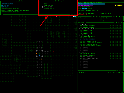

Hacking for Intel Markers
In short, you can now hack terminals to obtain position data for different kinds of objects. After a successful hack of a given type, the associated "intel" is displayed directly on the map as ASCII glyph markers at those positions.

Off-screen intel markers are shown at the edge of the map view in the direction towards that object, dynamically repositioning themselves as you shift the view. (This system works like the labels for off-screen exits demonstrated earlier.)


Various types of intel markers repositioned as the map shifts.

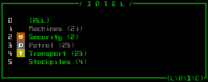
There are a number of different intel marker categories.

Machine Locations
If you're looking for a particular type of interactive machine, you can hack for a list of their coordinates.


The full list of hacking commands for retrieving machine coordinates. (The generic "machines" command simultaneously hacks the locations of all machines--difficulties are not set/balanced yet, and here I have some hackware equipped which modifies the chances.)

As marked on your map, these are represented by capital letters with a background that glows in the color associated with that machine:


Intel markers for two Terminals, two Recycling Units, and a Repair Station, all to the north.

The machine intel system works slightly different from the others. Intel marker data is usually deleted once that marker enters your FOV (i.e. once you've explored that area , or otherwise seen it again since last hacking for that intel). This is because most intel is aimed at moving objects, so the information becomes outdated and useless before long, anyway. Re-hacking for the same type of intel will also replace and update all old intel of that type.

As static inanimate objects, however, machines are not removed from your intel on seeing them. Even after leaving sight of a machine, the intel remains. Moreover, those machines you simply see (not hack) to discover are also added to your intel database. Thus all previously seen machines can be conveniently indicated along the map edge. Sure, even without this option you can always still shift the view and see them in previously revealed map areas, but having directional markers is a useful reminder of which direction to look.
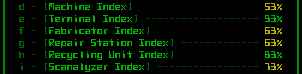
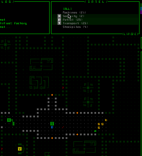
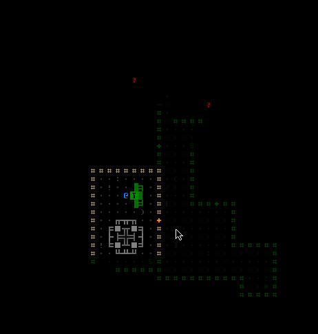
Tasked Squads
Groups of robots with a permanent task or one-off mission are marked with lower case letters, placed at their most recent reported location. The marker background color indicates how much you should worry about a given squad: green or yellow for non/low-danger, orange for common threats, and red for major threats.


Registered robots passing through a previously explored area--one surveillance unit (v), two patrols (p), and three maintenance bots (m).

Here is an example of the hacking shell's output on obtaining the latest coordinates of all patrols on the map:


Results of a successful patrol status hack.

While the fact that almost all squads are mobile reduces the usefulness of revealing positions of distant squads (except for those likely coming to track you down), it does at least show the overall types and composition of potential enemies out there and where their strengths and weaknesses are generally concentrated at a given point in time. More useful is the ability to discover what squads are nearby, and in this way squad intel is an alternative to the usual sensor combos, providing temporary information but at a much greater range.

There are currently nine different types of squad, but I'll leave the details for you to discover in game. I will mention that hacking positions for security squads is one of the most difficult, as those squads are stationary and knowing their positions across the entire map is incredibly valuable. That's the kind of information generally only available to dedicated hackers.
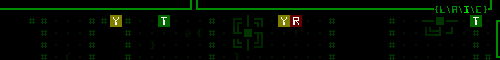
Stockpile Inventories
Component stockpiles are marked with their usual punctuation glyph based on item type, also coloring their background based on that type. (Stockpiles containing prototypes are further differentiated by their glowing foreground.)

However, know that stockpiles often contain more than one type of item, as well as multiples of each. To keep it simple (both for the UI, you, and I =p) the system records stockpiles based on their most abundant component, or if there are any prototypes those will become the primary stockpile identifier. So while you can't know the precise full contents of a stockpile, you can know what it's mostly comprised of.


A list of common (non-prototype) stockpiles stored on the map, followed by a failed attempt to retrieve the same for prototypes.

This intel can be very useful for determining whether you simply want to leave a map, or stick around to get that stockpile you just learned about in some nearby room. Especially if you see a stash of unguarded prototypes for the taking!


Intel Filters
So what happens if you really like hacking and turn your map edges into a completely unreadable mess of letters and symbols?


This.

I don't imagine you'll want to keep a large amount of intel visible at once, instead activating only those that are relevant and current.

For that the intel system has a new filter manager, implemented as the last multi-console mode. If you recall, the top-center portion of the UI is dedicated to the so-called "multi-console," which has multiple modes for optional features you may activate depending on what you need at the time. There are four modes: extended log space, combat calculations, the ally status and order system, and now intel management.


The multi-console area.

This scrollable console lists all the types of intel you possess for the current map (it always contains a listing for machine intel, since that can be obtained without hacking). Each type of intel can be toggled individually, or all at once via the "ALL" button.


Toggling intel data types for display on the map.

As with the ally management interface (and every other part of the interface), these filters are accessible via keyboard: Just press 'z' to enter intel mode, then the number corresponding to the type of intel to toggle.


"Intel mode" for keyboard input.

As an added convenience, newly hacked intel for a given type of object is automatically activated so you don't have to worry about remembering what intel you acquired after a hacking session.

Style Considerations
For intel markers we obviously need a compact and distinct style easy to distinguish from other map objects since they'll be persistent (while active) and placed directly on the map.

Fitting each marker into a single cell is naturally the best method of indicating something at that position, so the choice is simplified to one of which ASCII and how to color it. The initial concept was to go with a black character on a colored background, which if you've noticed is how the interactive piece of machines is normally represented on the map. So further differentiation is achieved via slow oscillation in background brightness. This helps them stand out from the rest of the (static) map more than anything.

Due to a variable typo in the initial test, the black characters appeared white the first time I saw them. After testing both methods it turns out the white look is better =p. White results in easier to read glyphs, being consistent with the light-on-dark look of the rest of the map, while having no negative impact on the markers' differentiation from other cells (since we have the glow-highlight effect).

Trivia
For the past year or so the concept for the final multi-console mode was actually called "signals," and looked like this:


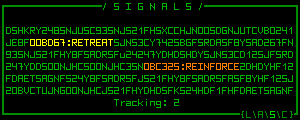
"Signals" multi-console concept (mockup).

The idea is the console is normally filled with junk data representing encoded transmissions Cogmind is picking up from the environment, and you could attach components capable of deciphering what other robots in your vicinity are thinking/planning, as well as whatever other information can be intercepted, including the number of enemies currently tracking you.

While fun, intel filter management offers a much broader range of possibilities, and serves as a bridge between the terminal hacking system and map overlays (which could even be further expanded in the future). The signals idea could technically still be added, though it might end up being too complicated a mechanic (?).

For now we'll relegate it to the list of many (though fewer than there probably should be) cut features.


More Terminal Hacks
Along with the intel update we've also got a new batch of useful terminal hacks.

Local Map Layout
Like hacking for squad positions, this option is an alternative to relying on sensor data (in this case terrain sensors and interpreters). When successful, this hack reveals the map layout for the zone in which the terminal is located.

I also coded a hacking command that reveals the entire map layout rather than a single zone, but it's far too powerful and will only be available under special circumstances (once I decide what those circumstances are...).

Hacking the map layout does not, however, reveal secret tunnels and doors. As protected information those are available only via another specific hack.

Exits and hidden doors are not part of the intel management system, since they have their own labeling system described earlier. But as part of the intel hacking update, newly discovered exits and hidden doors are auto-labeled as soon as you close the hacking interface:


While testing the new hacking system via a test terminal, I happen to discover a hidden door right next to me Wink.

Alert Level
I still haven't covered this game mechanic yet because it ties into the world as a whole, but for now know that the global alert level affects how the enemy reacts to you.

You won't generally know this alert level, but 1) you can guess when it's on the rise because the enemy will start taking you more seriously and 2) at a terminal you can also hack to learn the current level.


Retrieving the current alert level, which can range from "low security" to 1 to 5.

On the more useful side, if you're a good hacker you can proactively lower the system's alert level by falsely reporting that a threat has been dealt with, reducing the likelihood of more combat-enabled robots arriving in the map on various threat-related missions.

Squad Recalls
Beyond simply retrieving squad dispatch records and hacking for their latest position data, you can attempt to issue a recall order to any combat squad only temporarily in the map for a given mission. Call off investigations, strike teams, and even larger assault forces if you're good enough (and reach a terminal in time).

Sabotage
You can't recall squads which are permanently stationed on the current floor, but there is a new alternative for influencing them: Sabotage. With this hack you search the machine control network for vulnerable explosive machines, and overload them remotely. The former machine's location is marked on your map via the intel system, and the enemy will redirect a permanent patrol or security force to that location.


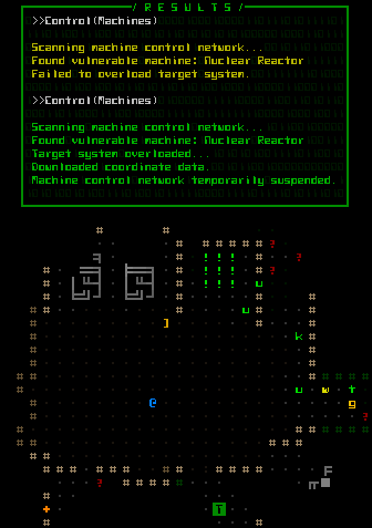
Detonating a nuclear reactor remotely (top), then later surveying the intel marker's position (bottom). There was obviously more than one reactor housed in this area--the massive explosion cleared out several rooms worth of space. Would have been fun if it were in the room next door (okay, maybe two doors down...) so I could hear them go off :D. It obviously took out some combat robot, as there's still a weapon lying on the ground nearby.

This is a fairly easy hack because you cannot completely control the effects--the vulnerable machine is chosen randomly from among those which may explode, the system itself decides what squad to relocate, and the overload may even fail to destroy the machine despite successfully hacking its system. To improve the strategic value of this hack I later went back and gave the system a much higher chance to relocate the squad nearest your terminal, so theoretically it becomes an effective option for clearing out dangerous areas without any fighting. In any case, sabotage is certainly a fun option--blowing up a reactor somewhere else on the map and later happening across the debris and a crater in the floor (if it hasn't already been cleaned up by then). Chain reactions are common and the resulting explosions can easily catch enemy robots passing by Wink

Warning: Going on an unchecked sabotage spree will most certainly raise the alert level and summon a whole lot of new friends to play with... or maybe that's what you want? :D
« Last Edit: February 18, 2015, 09:42:05 PM by Kyzrati » Logged

Armageddon
Level 6
*


View Profile
« Reply #465 on: February 18, 2015, 07:58:41 PM »

Those objective markers. This is hardcore man.
Logged

TheWing
Level 1
*


View Profile WWW
« Reply #466 on: February 19, 2015, 05:17:37 AM »

Oh I really like that signals-idea, though it wouldn't fit as a mechanic one would need to depend on to progress in game... I'd imagine it more as a "additional" thingle? Anyhow, keep up the great work !
Logged

- - - -
happymonster
Level 10
*****


View Profile WWW
« Reply #467 on: February 19, 2015, 07:29:21 AM »

Definitely Hardcore!
Logged
Kyzrati
Level 10
*****


View Profile WWW
« Reply #468 on: February 19, 2015, 07:38:26 AM »

Those objective markers. This is hardcore man.
Definitely Hardcore!
Well, I do show it at its most hardcore Tongue

Really you'll generally only keep one type of intel active at a time, if any, and probably for just long enough to check out what information you want. And I never really mentioned it but non-hacker players won't really be dealing with much intel, if any at all.

As for the interface, anyone playing with the ASCII will easily be able to identify what everything is, while for sprite mode it's likely I'll end up switching all the markers to icons. We'll see what the feedback is like once players start using it!

Oh I really like that signals-idea, though it wouldn't fit as a mechanic one would need to depend on to progress in game... I'd imagine it more as a "additional" thingle? Anyhow, keep up the great work !
Yeah, the original plan was to enable the player to attach parts that decipher the signals, just to have extra information to aid decision-making (sort of like intel, but more specific). The details revealed could vary depending on how effective those parts are. Mechanically speaking, it would more or less be another kind of non-required sensor. The way the game content is designed, there is absolutely no "must-have" component--it's entirely dependent on your desired strategy.
Logged

Quarry
Level 10
*****


View Profile
« Reply #469 on: February 19, 2015, 09:00:57 AM »

The level of polish at this stage of the game is just Tears of Joy
« Last Edit: February 19, 2015, 11:07:40 AM by Quarry » Logged
JobLeonard
Level 10
*****


View Profile
« Reply #470 on: February 19, 2015, 10:57:59 AM »

It's a display of a love for the craft, that's what it is. And I salute you for it  Coffee
Logged
James Edward Smith
Level 2
**


Mover & Shaker


View Profile WWW
« Reply #471 on: February 19, 2015, 12:07:05 PM »

God damn it, dude. This game looks so good.
Logged

Pike `n Shot  the first pshmup ever made. Twitter:@JamesEdSmith
Kyzrati
Level 10
*****


View Profile WWW
« Reply #472 on: February 19, 2015, 03:55:37 PM »

Thanks guys Smiley A love for the craft it is... it's what happens when you take a simple core idea that works, and was made in a very short time, then polish it for months and months and months and... all in the hopes that if this labor of love can recoup its costs then more can be made!

Too bad I really need to release soon, before it's done, but I guess it's "good enough" for alpha Wink
Logged

Kyzrati
Level 10
*****


View Profile WWW
« Reply #473 on: February 23, 2015, 06:17:24 AM »

Just added a little quality of life thing here, showing the actual hit chance during targeting mode on a per-weapon basis, indicating any weapon-specific modifiers (all you knew before was the base hit chance, and you'd have to calculate the rest yourself or actually fire and read the combat log). Here you can see the shotgun's recoil affecting all other weapons' accuracy values, as well as the launcher bonus. I'm moving the cursor around on different enemies, too:
Logged

JobLeonard
Level 10
*****


View Profile
« Reply #474 on: February 23, 2015, 08:01:10 AM »

Dat juicy but functional feedback...
Logged
Kyzrati
Level 10
*****


View Profile WWW
« Reply #475 on: February 23, 2015, 08:09:29 AM »

Lately I've been watching someone do Cogmind 7DRL LPs, and noticed how poor the hit chance feedback was, so this is a much-needed improvement. It will help teach players about weapon-specific decisions that have an impact on chance to hit, at the same time making it more clear which weapons will and will not fire (e.g. you cannot fire other weapons simultaneously with a guided weapon--it won't show percentage data for inapplicable weapons).
Logged

Kyzrati
Level 10
*****


View Profile WWW
« Reply #476 on: March 09, 2015, 05:06:43 PM »

Tileset 1.0
[Cross-posted from the devblog here--follow link for better formatting and light-on-dark style.]

Cogmind now comes equipped with an official tileset!

Originally we were aiming for two tilesets, one symbolic and the other realistic, but despite the promising concepts provided for the symbolic set, the artist unfortunately turned out not quite suitable for the position. With that we are down to a single tileset, though one with which I'm extremely satisfied.

Kacper has done an incredible job on the realistic set, going above and beyond simply following the specifications by coming up with a number of great ideas and suggestions that have improved tile mode's overall visual quality while keeping within our limits. It's been a pleasure working with someone who's as into the game as I am Smiley


Position filled, credits page updated :D


Symbolism vs. Realism
We showed pre-development tileset concepts in a number of different places, and a majority of responses were in support of the more abstract "symbolic" tileset, essentially taking the essence of ASCII and putting it into tileset form.

It's too bad we won't see that tileset come to fruition (at least not for now), though there is some consolation to be found in various other factors for consideration:
  • More than one of the prospective artists I consulted with during the hiring process made a valid observation, stating that "some of the symbolic sprites don't clearly represent anything." Ignoring the fact that this is in some ways the very definition of symbolic, it's true that in an unfamiliar fictional world it is sometimes necessary to create unfamiliar new symbols that the player then associates with new objects. In a complex enough world and at small enough sizes, these symbols can begin to seem arbitrary and opaque, making interpreting them somewhat difficult for the same category of player that has trouble with the highly symbolic nature of ASCII in the first place.
  • The question as to which tileset concept is superior was directed mostly at audiences already familiar with ASCII and traditional roguelikes. Players at the edge of or outside that circle generally preferred one of the non-symbolic concepts.
  • All early feedback was also based on rough concepts created by artists with minimal guidance. Any of the concepts could become much more than their original form, as you'll see below.
  • A portion of the players preferring a more efficient symbolic approach to the map can simply use ASCII (as many will). I'm confident that Cogmind is, after all, the most accessible ASCII game ever with a vast array of UI features to aid usability, among them auto-labeling. Objects are also represented using very uncomplicated symbol conventions and a relatively small number of glyphs--common objects use only 9 punctuation marks and 24 letter glyphs (counting upper and lower case as separate glyphs).
Against this background it would seem that the ideal tileset should be as different from ASCII as possible--non-symbolic, detailed, realistic.

For me as the designer, however, this exaggerates a problem I've been dealing with every time I think about Cogmind having a tileset: any pixel art representation runs counter to the intended look and feel of the game. As regular readers know, Cogmind's entire aesthetic and theme embraces the ASCII rather than using it as a makeshift crutch. You are the Cogmind, and that's how you see and experience the world. Many of the map and UI special effects rely heavily on ASCII, and the intro, inter-level animations (still WIP) and ending (WIP) are rendered entirely in ASCII as well.

Sure it's a game, but as part of the design philosophy I've made an effort to avoid anything that overtly gamifies the experience. I didn't even want the game to have a title screen--as it turns out there's still no start menu (nor will there ever be one), but I did finally cave on the title screen part...

I know, the game has both ASCII and tiles mode, so why fret? I'm sure it's a bigger issue to myself than anyone reading this blog, because as players most of you see Cogmind as a game. To me it's art. I have a vision for this piece of art, and feel like I'm sacrificing part of that vision to expand the appeal of the underlying game.

Of course a number of players out there also subscribe to the game-as-art-form mentality, especially in the indie world, and the appreciation of art is always a very personal thing once it's released into the world, anyway. By providing a tileset I suppose I'm simply giving the audience another tool with which to appreciate it, even if it does significantly affect the intended expression.

While in the future this dilemma will always exist whenever I have to decide how to prefer to present Cogmind, I can at least say that after some days playtesting with this new tileset, it's awesome, and certainly doesn't reduce the game component's awesomeness :D


Style
The non-symbolic representation of map objects should have both meaningful detail and a consistent look, and given the limitations this tileset does a wonderful job of both.


A sample scene showing the tileset at its smallest (12x12 cells) and largest (24x24 cells).

Kacper has squeezed an amazing amount of detail into a tiny area. Robot compositions highlight their primary features and functionality; item forms reflect their categories and subtypes while remaining distinguishable from one another when necessary. How does he do it?

Before getting into analysis of specific object types further below, the short answer is by focusing on a simple shading scheme. At the small sizes required, softening tiles with excessive shading costs too much space that can otherwise be used to define details (an even more significant limitation without multicolored tiles). By contrast, this tileset uses a mere three shades:


Grayscale ramp from Cogmind's tileset. The detail!

As you'll see with the robots and items, these shades aren't used to create any kind of gradient, instead being assigned as a primary color vs. detail color. The result is extremely sharp sprites that pack a lot information into a small area, and also mesh well with the sharpness of the UI.

One drawback we've discovered to relying on such a simple monochrome color ramp is that while on the perfect hardware the darker two colors are nicely distinct from one another, they appear much closer on lower-quality LCDs, causing sprites to lose some of their internal contrast. Correcting for this on one setup results in less than ideal viewing conditions on another. The current ramp is best displayed on high-contrast monitors with true blacks. Hm, as I write this I've begun imagining some kind of adjustable gamma option that changes the actual ramp itself, allowing the player to set relative brightness of each spritesheet component to whatever looks good on their particular monitor...


Machines
Machines were outside the scope of the original tileset specifications. As mentioned before, I'd be okay with mixing ASCII machines with a minimalist tileset, though Kacper decided to tackle the issue, anyway. The result is quite promising, and does a good job of pixelizing the machines such that they fit well alongside our other map sprites.


A comparison of non-interactive machine ASCII originals vs. their pixel version created using one-to-one glyph substitution.

The effect works well enough with non-interactive machines (the gray ones, seen above and as described earlier).

However, because interactive machines are often both smaller and use more outward-oriented designs than non-interactive machines (whose designs are larger and inward-oriented), that subcategory doesn't look nearly as good. This is cause for some hesitation in making this change permanent as is. A redesign of the base ASCII glyph arrangement would resolve the issue, but also might result in a less effective ASCII version.

Either way, the spritesheet has already been expanded to allow for an alternate set of ASCII line glyphs specifically for machines (the original set was still needed for UI elements that use the map font). For anyone who would like to use tiles but prefers the basic ASCII machines (not yet sure if that type of hybrid player even exists!), the config file does contain that option.


Terrain
More work went into the terrain than I initially expected. At first I was thinking "okay, we'll just replace the hashes with one of a handful of wall tiles and that's it." It's not quite that simple, though keep in mind we're still not doing linked and oriented walls--they don't really add anything for Cogmind, in which terrain is incredibly simple and the focus is on tactical layout (plus oriented walls can unfairly give you too much information).

The first unplanned change is the removal of ASCII dot/period floors. They are replaced with a faint gray rectangle representing the floor section, and do a good job of reducing visual clutter when the general noise level has already been increased by pixel art.

I hadn't considered the possibility, and even imagined it might be incompatible with the particle effect animations, but Kacper dropped it into the tileset so I figured I may as well try it out. I like it. Tests show that it is not only perfectly compatible the hundreds of existing particle effects, it even enhances some of them.


See the floor tiles highlighted by these UI animations, the red volley rangefinder and the green launcher AOE scan.

Strewn about on lower levels, and blown off robots and machines to slide across the floor, you'll often see mechanical debris:


A roomful of mechanic debris in the aftermath of my reckless rocket rampage. Oh look, here comes another to join the scrapheap...

The tileset contains 16 debris tiles in all, one for each of the possible gray background ASCII debris symbols. Both the tiles and ASCII debris punctuation are organized by their pixel density so that areas of debris created by a noise function will look a little more natural.


Tileset debris, with corresponding ASCII for comparison. (A couple of the ASCII may seem out of density order, because that order is based on a multi-font average.)

The most prominent terrain feature, walls, required the most tweaking of any tile type despite their relative simplicity. Adjusting them also required making the tileset's only deviation from the standard color ramp described earlier.

The issue stems from the tileset coloring system, which draws directly from the colors and levels assigned to the ASCII, all fully saturated colors with a specific brightness level (usually fairly bright).

Wall ASCII universally use the hash ('#') symbol, which naturally has a lower pixel count than any wall tile. Thus using the same color for ASCII and tile walls means the latter will require a lower brightness to avoid overpowering everything else on the map, especially since wall tiles are almost always the most numerous visible object. As explained in the original tileset specifications, this is easily achieved in the spritesheet by using a non-white color. So the original grayscale ramp (which uses pure white as its brightest color) needs to change a bit for that. (For the record, Kacper didn't like the idea of deviating from the ramp, but was a good sport and understood that it had to be done for the greater good =p)

The brightest wall color was therefore lowered from gray 255 to 225, so from 100% brightness to 88.2% brightness. But that doesn't go far enough to produce the best wall effect for the map as a whole (Kacper cringes). Honestly I really like the walls at their original sharpness, but that detail is at the same time distracting when it's repeated across the map. We needed to reduce the contrast on those details to help other objects stand out more. So I progressively raised the brightness of all the darker colors to tighten up the color ramp and make it easier to focus on objects other than walls.

You can see the testing process below, taking the factory walls as an example:


Tweaking the grayscale ramp for walls.

If the change seems subtle to you, it's more meaningful when trying to play on a full-sized map with other objects mixed in that you'd prefer to be focusing on. This effect is even more pronounced at larger tile sizes.

As for unique walls, currently there are only six types--wall variety is a good bit less than the number of map types, because some maps simply use recolors (e.g. for the same general area and theme but still different in some way). Not unlike other traditional roguelikes, Cogmind is not about terrain--it's about interacting with the occupants and objects found among that terrain. There are (and will be many more) interesting environments, but they are created primarily from machines. Walls are merely barriers to influence tactical positioning, and tentative ones, at that, since you can always blast your way through them to forge new pathways :D. (Note: Always consider what may be on the other side!)

Compared to walls, doors were left completely unchanged from their original ramp, since we want those to stand out--they even use a bright pure orange to achieve that purpose. So we get to keep their juicy crisp details (Kacper sighs in relief). Same with stairs and branch access points.


Heading through a door to find an exit. You are going to be really happy to see one of these in game, because finding them is your primary objective, but not always that easy.
Logged

Kyzrati
Level 10
*****


View Profile WWW
« Reply #477 on: March 09, 2015, 05:07:01 PM »


Robots
When I first saw Kacper's robot concepts I thought to myself, this could be Cogmind! It wasn't the same feeling I had with the other tileset concepts, which could at best be classified as "okay, this could possibly become Cogmind with some work."

Some viewers might claim the robots are too intricate, with pixel-sized details too small to clearly make out, and this is certainly a valid point (as valid as any opinion about works of art--some of us can make out the details when we stop to inspect them for fun :D).

Most importantly, the tileset is designed such that you don't have to focus on the details to distinguish robots from one another. Each robot highlights its important features to define an overall shape that is usually unique to that robot. This is not especially difficult with Cogmind's robots in particular, because each robot must be unique in its loadout and behavior in order to exist in the first place. There are no "this robot is just like that one but with a different gun" situations.

See the cast of early-game combat robot classes that haven't changed since the 7DRL prototype:


The prototype's combat robots have all grown up and got sprited!

The many new additions have even more unique appearances. And of course the non-combat robots with their especially unique behaviors look completely unlike anything that you fight. Plus they're all green. Regarding other colors, combat robots appear in yellow, orange, or red depending on the threat level of that particular variant; NPCs are pink so they really stand out; and there are also gray and brown robots, but those belong to a category you'll have to discover in the game.

In any case, the robots above are fairly easy to distinguish, even more so when you see them in action because they are both labeled directly on the map and have their own unique weaponry or other behavioral differences--for example Swarmers always travel in big groups, Sentries always work alone, Watchers zip around sending out alerts without shooting anything at all, etc.

Notice I'm not showing the Behemoth here, because it's now four times as large as any of these... nope, not going to mistake that for anything else!

What I like most about these and the many other sprites is that they accurately depict a cold mechanical world of robots, and at such a small size! The sprites even properly reflect a given bot's size and loadout (mostly regarding propulsion and tools/weaponry, though sometimes even extending to additional components).

How do they do it?

First of all, the three-shade limit mentioned before is a very useful restriction here, as fewer shades enables sharper images, which means greater detail.

On top of that the robot sprites use a 3/4 oblique right-facing perspective, which is the best way to increase the variety of recognizable features that can be depicted. Forward-facing sprites leave a lot less room for variation, and work better with multi-hued tiles (which we don't have in Cogmind).

Each visible side uses one primary shade plus a secondary shade for detail (with each side sharing a shade, for a total of 3):


The tri-shade Grunt as it appears in the spritesheet, x10.

Of course at the smaller tile sizes the detail only helps if you want to examine individual units up close, when during normal play all you care about is what is where. So at the same time we tried to give each robot a fairly distinct shape to aid at-a-glance recognition, as explained earlier.

Most interestingly, while you might expect that we'd leave some room in between robot tiles to keep them separate on the map, we didn't! Robots are allowed to utilize the full width and height of their cell, so 12x12 in the base tileset, and the understanding is that the perspective shading helps you visually identify where one robot ends and another begins. The extra column and/or row of pixels to use for the robot itself gives more room in which to clearly define a unique shape, with a wider stretch of shaded edge where useful.


Robots' perspective shading aids visual separation on the map. Here I've let myself get surrounded for screenshot purposes--don't try this at home, kids. During combat you can safely ignore anything that's green, and this particular scene simultaneously contains all four types of combat unit seen in the introductory levels of the game: To the north a pair of incoming grunts along with three surveillance bots happening by (quite rare, actually), and to the south a group of Swarmers flying around a Sentry.

Sure you can end up with dense, broad clusters of objects requiring a little extra time to thoroughly parse, but this is an issue even with ASCII. The point is it's not incredibly difficult once you're at least familiar with the individual objects. We've playtested it and are satisfied that it works just fine.

(I'll also add here that if you really are staring down a massive group of enemies in Cogmind, you're not going to care so much about its composition--you'll instead do one of two things: run, or point your guided nuke in that general direction and kiss them goodbye... after which you will then probably run anyway because firing a guided nuke tends to piss everyone else off =p)

That's it for the robots--there are quite a few more cool ones in there, but I'll leave those for you to discover!


Items
Considering how tiny the items are, Kacper did a great job making them individually recognizable while ensuring that related subtypes share certain qualities. Because there is only one category of items that you won't find almost immediately in the game, these I'm mostly free to show you now without spoiling anything big.


(Most of) Cogmind's item types in their uncolored spritesheet form, both at 12x12 and 24x24.
  • Matter and Data Cores are unique items that you'll be seeing frequently.
  • Propulsion: These are quite distinctive, and each does a good job of resembling its type, for the most part also taking the same form in which they're used on the robot sprites.
  • Utility: "Devices" is a pretty vague all-encompassing category, so it gets an equally vague sprite. Storage is quite specific by comparison, and appears appropriately box-ish. Processors and hackware are essentially two varieties of the same thing (small chip-like components), so they look similar but not quite the same because the player may or may not be interested in hackware at all. A large portion of protection utilities are armor, hence that riveted piece of metal.
  • Power: The sprites here reflect power source progression itself in that these subtypes are simply increasingly powerful versions of the same general thing.
  • Weapons: Cannons are larger, and energy vs. ballistic each have their own unifying characteristics. The launcher is a monster of a weapon in a size of its own, giving it that extra HELL YEAH feel when you find one (they are quite nice to have). Special weapons are usually tools and whatnot, so they look a bit more functional. Melee weapons (including the datajack), share a basic form but all remain distinctive.
Unlike robots, item sprites are actually colored differently from their ASCII counterparts. ASCII uses glyphs to represent a category and further distinguishes the subtypes within each category by color. This is more efficient for interpreting ASCII map data, enabling the player to quickly locate all items of a particular category (say, all the '= are types of propulsion) rather than differentiating everything equally at the subtype level; there are also not enough punctuation marks for 27 item subtypes, but plenty of extra if we do it this way. It's the least confusing way to take advantage of the ASCII representation.

Because item sprites each have their own unique form, we are free to use color however we need to. Thus items are instead colored by their effectiveness rating. Each item is manually rated by how effective it is on a scale from 1~10, and colored appropriately on a sliding color ramp from cyan to purple to crimson. These colors have the advantage of being different from those used for any robots, so you can pretty easily tell the difference between an item and robot sprite even before examining their shapes.


All the treads in the game as they appear on the map, from the lowest-rated Light Treads to Huh?.

Using multiple colors for these may not be worth the added visual clutter, and to reduce confusion I'd consider changing all items in tiles mode to cyan or purple based on player feedback. (After all, this extra information is not available in ASCII mode, and it's not a problem there.) I'm not particularly bothered by it, but it's something I'd like others to weigh in on once they have their hands on the game.

(Color scheme exceptions: The common matter item is always purple, with a brightness based on how much matter is located there; data cores are always green.)

Besides their color and generally smaller size, item sprites are further differentiated from robots by their facing/shading. Notice that items are left-oriented, another good idea by Kacper.


Summary
Using the tileset certainly changes the feel of the game, which is somewhat hard for me to get over, but I do love it for what it is, think it handles itself well despite the limitations, and after playing with it for a while I must say it's starting to grow on me.


Some (true) playtesting with 12x12 tiles. I just found me a ROCKET LAUNCHER. Splash damage be damned, you're all going down.

Currently this tileset has only been developed at the base size, 12x12 cells, while other sizes will be extrapolated all the way up to 24x24, the 1440p dimension, without additional detail. Thus the relatively tiny size you see above actually applies only to those of you using a 1366x768 desktop (720p). Greater resolutions will be using larger versions of the tileset and have a slightly low-res appearance, working in the same way as previously shown scaled fonts.

A comparison of the two extremes, showing the same scene from Cogmind as it would appear in 720p vs. 1440p:


Cogmind tileset in 720p. (Screenshot taken in a 4:3 window, so the interface is not set to its true 720p aspect ratio--demonstration for tile size only.) Click for full size.


Cogmind tileset in 1440p. (Screenshot taken in a 4:3 window, so the interface is not set to its true 1440p aspect ratio--demonstration for tile size only.) Click for full size.

Regarding even smaller resolutions (e.g. 800x600), the game also supports those, but as this particular tileset can't properly be scaled down they are currently ASCII only.

So you've finally reached the bottom of my 4,000-word Great Wall of Text intro to the tileset... What do you think?
Logged

JobLeonard
Level 10
*****


View Profile
« Reply #478 on: March 10, 2015, 01:42:06 AM »

 Hand Clap Waaagh!

The sprites have this heavy, solid feeling to them, even evoking a sense of volume. Very fitting for clanky metal robots!
Logged
deab
Level 2
**


View Profile
« Reply #479 on: March 10, 2015, 01:49:40 AM »

Looks fantastic, really like the 3 shades technique. I'm not someone who would play using ascii but the tileset would be fine, just enough to pick out the meaning of the sprites while keeping it clean looking.
Logged
Pages: 1 ... 22 23 [24] 25 26 ... 71
Print
Jump to:  

Theme orange-lt created by panic