|
Yrgkala
|
 |
« Reply #4900 on: May 27, 2012, 04:59:16 PM » |
|
|
|
|
|
|
 Logged
|
|
|
|
|
DustyDrake
|
|
« Reply #4901 on: May 27, 2012, 05:10:37 PM » |
|
fantasy diplomet?
|
|
|
|
|
Logged
|
|
|
|
|
Yrgkala
|
|
« Reply #4902 on: May 27, 2012, 05:25:00 PM » |
|
fantasy diplomet?
Now that you say it, it can be read like that; it's not intentional, the worm's tongue wasn't meant to modify the letter |
|
|
|
|
Logged
|
|
|
|
|
DustyDrake
|
|
« Reply #4903 on: May 27, 2012, 05:29:46 PM » |
|
actually it's also the shading on the 'a' in it as well, because it's different from the other two 'a's in the picture.
I never even noticed the snake's tongue until you said something
|
|
|
|
|
Logged
|
|
|
|
|
Yrgkala
|
|
« Reply #4904 on: May 27, 2012, 05:44:52 PM » |
|
Right,  |
|
|
|
|
Logged
|
|
|
|
|
Xion
|
|
« Reply #4905 on: May 27, 2012, 06:18:44 PM » |
|
why the filter?
|
|
|
|
|
Logged
|
|
|
|
|
Yrgkala
|
|
« Reply #4906 on: May 27, 2012, 06:28:56 PM » |
|
I like low-opacity texture overlaid on upscaled pixelart, with the texture strongly sharpened by itself and then again sharpened merged with the pixelart, because then it looks like printed on a physical medium, which I think makes it more immersive.
|
|
|
|
|
Logged
|
|
|
|
|
Μarkham
|
|
« Reply #4907 on: May 27, 2012, 07:03:45 PM » |
|
It looks like it was printed on the crumpled tin foil wrapping of a mint patty.
|
|
|
|
|
Logged
|
|
|
|
|
emacs
|
|
« Reply #4908 on: May 27, 2012, 07:06:52 PM » |
|
I don't think it looks bad at all, it's a hell of a lot better than some of the other pixel pieces that have a NPA texture on them I've seen around here.
|
|
|
|
|
Logged
|
|
|
|
|
Rykuth
|
|
« Reply #4909 on: May 28, 2012, 05:40:51 PM » |
|
I don't mind the texture bit, but I liked the contrast on the image before the filtering. I think it's harder to read afterwords because of the decrease in contrast. This is especially true for me in the lighter areas like the text and the heads/faces.
|
|
|
|
|
Logged
|
|
|
|
|
Yrgkala
|
|
« Reply #4910 on: May 28, 2012, 10:09:32 PM » |
|
* Brightened up the entire image to make room for 1 color darker than all others, for outlines, to make it more readable * Made the positioning of the text less arbitrary * Removed texture & sharpness * Eyes of different color, to imply different controlling players * Removed the king as he was too messy, replaced his position with a textbox by the axeman, also making more room for the text  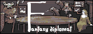 |
|
|
|
|
Logged
|
|
|
|
|
Franklin's Ghost
|
|
« Reply #4911 on: May 28, 2012, 10:14:44 PM » |
|
Looking really nice, like the eye colour change but think the size difference between the F and the rest of the letters is too much.
|
|
|
|
|
Logged
|
|
|
|
|
HöllenKobold
|
|
« Reply #4912 on: May 28, 2012, 10:19:03 PM » |
|
I think you should change the title font. The white is kinda blaring in comparison to the rest of the palette. I think something like a soft yellow would work a lot better.
|
|
|
|
|
Logged
|
 | Hell pits tend to be disguised as
things that would lead a passerby to
not think of them as portals to
eternal gnashing and wailing. |
|
|
|
|
Yrgkala
|
|
« Reply #4913 on: May 28, 2012, 10:21:22 PM » |
|
Looking really nice, Thanks like the eye colour change but think the size difference between the F and the rest of the letters is too much.
With that it was meant to recall medieval initials:  But the silhouette of the table had to remain as visible as possible (because it should be very visibly the CORE of the image as negotiations around a table would be the CORE of the game), so it couldn't be detailed & rectangular like medieval initials (often?) were; also, I think placement that stretches (almost) completely from one edge of "something" to another edge of "something", looks more "balanced". I think you should change the title font. The white is kinda blaring in comparison to the rest of the palette. I think something like a soft yellow would work a lot better. The message boxes on the image are already very bright grey, and the text has to be brighter than them. |
|
|
|
« Last Edit: May 28, 2012, 10:26:34 PM by Yrgkala »
|
Logged
|
|
|
|
|
Franklin's Ghost
|
|
« Reply #4914 on: May 28, 2012, 10:37:51 PM » |
|
With that it was meant to recall medieval initials:
Good point, can't argue with that  |
|
|
|
|
Logged
|
|
|
|
|
Geti
|
|
« Reply #4915 on: May 28, 2012, 10:39:38 PM » |
|
What's stopping you moving the text below the image? Right now they clash like anything, the F completely cuts the image in half.
|
|
|
|
|
Logged
|
|
|
|
|
Yrgkala
|
|
« Reply #4916 on: May 28, 2012, 11:12:07 PM » |
|
 I suppose it does look better. (originally I was going for the restrictions of this) |
|
|
|
|
Logged
|
|
|
|
|
Geti
|
|
« Reply #4917 on: May 28, 2012, 11:53:32 PM » |
|
Ah, makes more sense that you're trying to cram stuff in then.
I'd shrink the F, put it in a coloured, enlightened text style box thing, and have the title at the bottom centre of the image if I was trying to fit it into that size. That way you've got your people around a table, negotiations, and the title all integrated rather than sitting on top of each other.
|
|
|
|
|
Logged
|
|
|
|
|
Xion
|
|
« Reply #4918 on: May 29, 2012, 02:23:30 AM » |
|
I don't mind the texture bit, but I liked the contrast on the image before the filtering. I think it's harder to read afterwords because of the decrease in contrast. This is especially true for me in the lighter areas like the text and the heads/faces.
I agree with this. The original's contrast was spot on, everything after has been washed out and posterized and just plain doesn't look good imho. |
|
|
|
|
Logged
|
|
|
|
|
TobiasW
|
|
« Reply #4919 on: May 29, 2012, 02:40:27 AM » |
|
This version. It's perfect. Peeeerfect. |
|
|
|
|
Logged
|
|
|
|
|
 Developer
