|
jctwood
|
 |
« Reply #21660 on: March 05, 2013, 11:22:24 PM » |
|
Wow those are really interesting and provocative Softchange!
|
|
|
|
|
 Logged
|
|
|
|
JOBA
Level 1

EZ

|
|
« Reply #21661 on: March 06, 2013, 05:13:49 AM » |
|
 Redrew some of them. Paladin has to go, looks too much like a creepy rapist. Sorcerer also has creepy vibe. Face color is still not optimal, i think it needs a little bit of that orangy tint. Knight and Cleric look better because the light source is from the side I think. I think these are much improved; the knight and cleric have a sense of real personality in this one. The strong sense of lighting helps define their features, also, so they look more natural and realistic, whereas e. g. the paladin's nose looks flat and shapeless. I personally think the skin color is alright here. The colder tint just makes it look like they're outdoors on a somewhat cloudy day or something like that. I think you should go with whatever skin color seems to go with the setting and general vibe of the game and its other graphics (if there are any yet), since skin appearance heavily depends on lighting. Thanks, man. I'll start with undergrounds, dungeons and caves. If I manage to get the content done there, I might add outdoors.  Fullsize FullsizeI'll certainly return to portraits, they look somewhat passable as programmers-art for now. UI is kind of ugly and needs lotsa pixelin work. |
|
|
|
|
Logged
|
|
|
|
|
s_l_m
|
|
« Reply #21662 on: March 06, 2013, 05:19:13 AM » |
|
I love the old school rpg look joba, not so much specifically your pixel art, but the whole games look in general. Although (I think people have already pointed this out) the left two faces are way better than the right two
|
|
|
|
|
Logged
|
Think happy thoughts.
|
|
|
|
makallenz
|
|
« Reply #21663 on: March 06, 2013, 06:34:29 AM » |
|
 Had some fun working on these two. I'm a huge DBZ fan(still) so I wanted to do my own little fan piece. I might be making more  |
|
|
|
|
Logged
|
|
|
|
|
meek
|
|
« Reply #21664 on: March 06, 2013, 06:54:54 AM » |
|
This really reminds me of something I was working on a little while ago. They have a similar style:  |
|
|
|
|
Logged
|
|
|
|
|
Pietepiet
|
|
« Reply #21665 on: March 06, 2013, 08:46:09 AM » |
|
 metal gear rising is really good, you guys |
|
|
|
|
Logged
|
|
|
|
|
Quarry
|
|
« Reply #21666 on: March 06, 2013, 09:45:40 AM » |
|
OMG HEELS SO FEMININE
|
|
|
|
|
Logged
|
|
|
|
|
jctwood
|
|
« Reply #21667 on: March 06, 2013, 10:42:28 AM » |
|
Pietpiet, revengance is really sweet but that gif is even cooler, now all you need is raiden to slice a mellon every 200 frames!
|
|
|
|
|
Logged
|
|
|
|
|
saibot216
|
|
« Reply #21668 on: March 06, 2013, 11:38:45 AM » |
|
I'll start with undergrounds, dungeons and caves. If I manage to get the content done there, I might add outdoors. Fullsize Gettin real Ultima Stygian Abyss vibes here  |
|
|
|
|
Logged
|
|
|
|
|
clockwrk_routine
Guest
|
|
« Reply #21669 on: March 06, 2013, 01:01:31 PM » |
|
  nyam nam nam  the result of animating brushes and animating frames |
|
|
|
« Last Edit: March 06, 2013, 03:46:02 PM by softchange »
|
Logged
|
|
|
|
|
Happy Shabby Games
|
|
« Reply #21670 on: March 06, 2013, 06:27:46 PM » |
|
lovely stuff pietpiet & softchange here's the title graphic for a game malec2b and i are finishing up. i'd be super grateful for critique and/or a quick paint over. drawing landscapes is foreign to me  it's an abandoned city within some shallow canyons. there's a tar pit to the west. |
|
|
|
|
Logged
|
|
|
|
|
Derek
|
|
« Reply #21671 on: March 06, 2013, 06:37:45 PM » |
|
Spaceship!  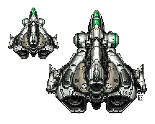 I’ve been experimenting with doing pixel art by painting them at double-size before reducing them (Nearest Neighbor) and detailing pixel-by-pixel. While I’m detailing, I’ll reduce the number of colors a few times, too. (This is in Photoshop.) Seems to work alright! http://mossmouth.tumblr.com/post/44754568622/pixel-spaceship |
|
|
|
|
Logged
|
|
|
|
|
s_l_m
|
|
« Reply #21672 on: March 06, 2013, 06:45:29 PM » |
|
That would be an awesome look for a shmup.
|
|
|
|
|
Logged
|
Think happy thoughts.
|
|
|
|
ClayB
Guest
|
|
« Reply #21673 on: March 06, 2013, 06:47:50 PM » |
|
lovely stuff pietpiet & softchange here's the title graphic for a game malec2b and i are finishing up. i'd be super grateful for critique and/or a quick paint over. drawing landscapes is foreign to me it's an abandoned city within some shallow canyons. there's a tar pit to the west. lovely colors! reminds me of an old movie poster |
|
|
|
|
Logged
|
|
|
|
|
clockwrk_routine
Guest
|
|
« Reply #21674 on: March 06, 2013, 06:48:00 PM » |
|
oh shit derek Spaceship! I’ve been experimenting with doing pixel art by painting them at double-size before reducing them (Nearest Neighbor) and detailing pixel-by-pixel. While I’m detailing, I’ll reduce the number of colors a few times, too. (This is in Photoshop.) Seems to work alright! http://mossmouth.tumblr.com/post/44754568622/pixel-spaceship |
|
|
|
|
Logged
|
|
|
|
|
TNERB
|
|
« Reply #21675 on: March 06, 2013, 06:50:48 PM » |
|
it's an abandoned city within some shallow canyons. there's a tar pit to the west. That thar is a mighty fine color pallet |
|
|
|
|
Logged
|
|
|
|
|
GhostBomb
|
|
« Reply #21676 on: March 06, 2013, 07:34:08 PM » |
|
Spaceship! I’ve been experimenting with doing pixel art by painting them at double-size before reducing them (Nearest Neighbor) and detailing pixel-by-pixel. While I’m detailing, I’ll reduce the number of colors a few times, too. (This is in Photoshop.) Seems to work alright! http://mossmouth.tumblr.com/post/44754568622/pixel-spaceshipWHAT ARE THE IMPLICATIONS OF THIS? |
|
|
|
|
Logged
|
|
|
|
tanner bananer
Level 1
aspiring train conductor

|
|
« Reply #21677 on: March 06, 2013, 07:55:10 PM » |
|
Rotoscoping cuz mooosh.  |
|
|
|
|
Logged
|
|
|
|
|
Theophilus
Guest
|
|
« Reply #21678 on: March 06, 2013, 08:56:55 PM » |
|
Looks nice derek, has a metal slug vibe to it. The last level in 3 (i think) comes to mind, where its in space.
|
|
|
|
|
Logged
|
|
|
|
|
Miko Galvez
|
|
« Reply #21679 on: March 06, 2013, 09:23:22 PM » |
|
Is it just me or some parts of it feel pillowed and the dark lines inside the sprite don't really fit well? |
|
|
|
|
Logged
|
|
|
|
|
 Developer
