Thank you for your supportive words.
It's nice to meet the independent game creators community. We know we'll learn a lot here!
Here are some answers :
I don't really like the kid's head. Looks like an acorn in the third image.
You mean you don't like the design of the character or is there only a problem on her pose in the 3rd image?
Is the character's face on the title banner OK?
nice o.O Can we see some of the animations? Would love to see it in action!!
We'll post a video as soon as possible!
Okinawa is one of the places I need to visit.
We've spent 1 month in Okinawa, going island-hopping. We'll never forget this place!
Amazing! Can't wait to see more of this. Absolutely love your watercolour work, been looking at your blog before, very inspirational!
Really? We fell in love with Pavilion at first sight, a few months ago.
You are giving life to a very unique world.
It's a great honor to meet one of its creators. Thank you!
Ouaaiii! This pleases my eyes greatly. Les couleurs sont très Ghibli. =D
Merci! We love Ghibli.
I'd be curious to know what your process is for digitizing the artwork. Also, on your blog, the animated water looks like digital on top of the watercolour, no?
I've been playing around with trying to use watercolour in games for a while and have yet to find a decent solution.
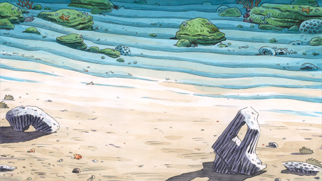
Yes, it's difficult to scan a watercolour. Colours never looks as good on the screen as they were on paper. Especially the blue-green of the tropical sea: the scanner reads it blue.
So we need to make a lot of colour adjustments. It's difficult to explain that part of the work.
When the scan is OK, there's still lots of work on photoshop before we get the final background.
Here is an example. This is the final scan. Everything you see here has been drawn on paper:
On a new layer (multiply & 60% opacity), we add a blue shading on the top of the image to enhance the feeling of depth (it's very subtle).
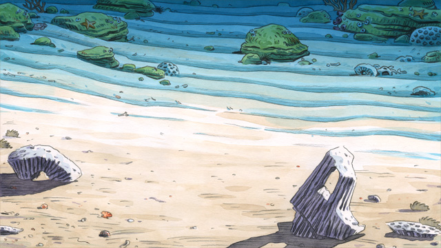
On a new layer (30% oppacity), we draw the sea. You're right: it's one single digital tone.
But maybe we'll use a watercolour texture later so it won't look digital.
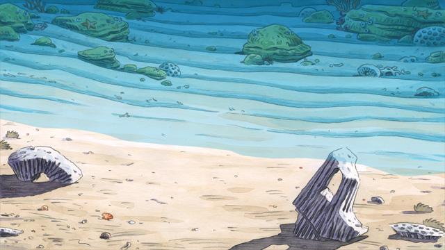
On a new layer (100% opacity), we add the emerging rocks (taken from the original scan)
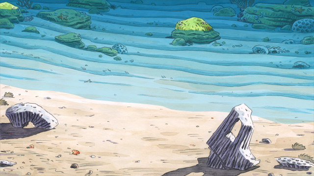
Finally, on the last layer (opacity 40%), we add the reflections. It's one single digital tone: pale blue.

Animating the sea is a difficult problem. We can't do it in watercolour. It would take a huge amount of time... but we don't want it to look too digital.
We need to find the right balance!
We hope this explanation was clear enough!
Ask us if you don't understand something.
 Community
