|
SeanNoonan
|
 |
« Reply #28880 on: January 03, 2015, 05:29:50 PM » |
|
 Attempted to recreate Jack B. Nimble in the style of Yoshi's Island as part of today's pixel dailies study.  I think I was reasonably successful. There are definitely some issues, but I didn't have much free time today. |
|
|
|
|
 Logged
|
|
|
|
|
SolarLune
|
|
« Reply #28881 on: January 03, 2015, 07:25:38 PM » |
|
Tower 57 - Hexapod:
This is super duper smooth and really readable at such a small scale. Good work! @Sean - Nice work to you as well. You probably want to bump down the number of colors a bit; you're basically getting banding on some parts of the sprite unnecessarily. |
|
|
|
|
Logged
|
|
|
|
|
SeanNoonan
|
|
« Reply #28882 on: January 03, 2015, 08:55:12 PM » |
|
Tower 57 - Hexapod:
@Sean - Nice work to you as well. You probably want to bump down the number of colors a bit; you're basically getting banding on some parts of the sprite unnecessarily. Agree - I am a bit of a noob and was doing my first attempt studying a style (outside of my fling with the Gameboy last year), so was trying to use a similar number of colours. That said, if you have any specific feedback I'm all ears (eyes?) - would be great to get some help from someone more experienced  |
|
|
|
« Last Edit: January 03, 2015, 10:04:43 PM by SeanNoonan »
|
Logged
|
|
|
|
|
aamatniekss
|
|
« Reply #28883 on: January 04, 2015, 10:42:37 AM » |
|
 Trying to make an underwater level. |
|
|
|
|
Logged
|
|
|
|
|
CyangmouArt
|
|
« Reply #28884 on: January 04, 2015, 03:01:01 PM » |
|
strongest artstyle? 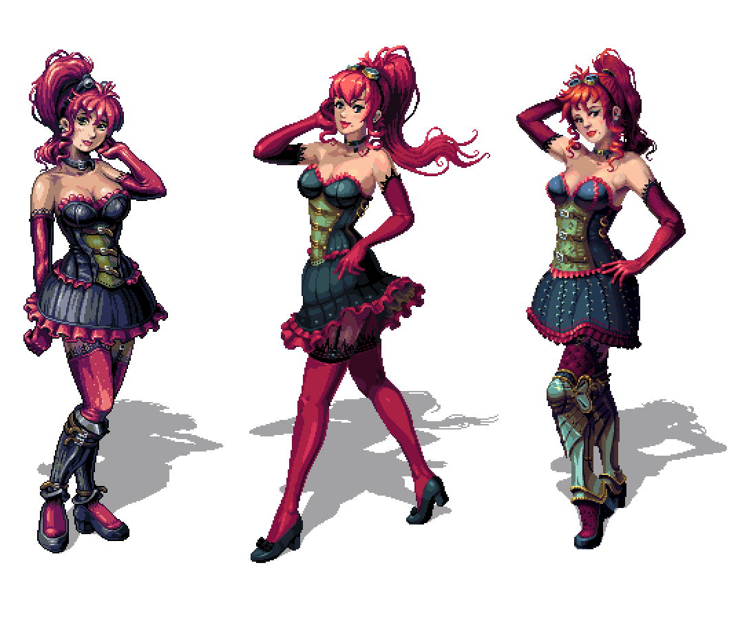 |
|
|
|
|
Logged
|
|
|
|
|
gimymblert
|
|
« Reply #28885 on: January 04, 2015, 03:08:29 PM » |
|
first!
If a bit too anime
|
|
|
|
|
Logged
|
|
|
|
|
sam_suite
|
|
« Reply #28886 on: January 04, 2015, 04:41:09 PM » |
|
I think the middle one is by far the best, but I have an unfounded personal vendetta against heavy outline use
|
|
|
|
|
Logged
|
|
|
|
|
Torchkas
|
|
« Reply #28887 on: January 04, 2015, 04:50:43 PM » |
|
I think I'm liking the third one the most for the face properties and the more detailed outfit design.
|
|
|
|
|
Logged
|
|
|
|
|
gimymblert
|
|
« Reply #28888 on: January 04, 2015, 05:01:02 PM » |
|
At least anatomically the first one is the most well executed one
- the second is unbalanced esher girl
- the third has the leg volume and support totally fucked up
- third also have the most interesting face.
- First is just a better overall execution.
|
|
|
|
|
Logged
|
|
|
|
|
SeanNoonan
|
|
« Reply #28889 on: January 04, 2015, 05:45:52 PM » |
|
Continuing with the Pixel Dailies thing - I'd like to think I can keep this up  A rework of a Metal Slug character for today's #metalslug theme. I think with a little more work to the proportions this could be the character I use in my next game prototype |
|
|
|
|
Logged
|
|
|
|
|
Jad
|
|
« Reply #28890 on: January 05, 2015, 04:29:15 AM » |
|
rendering on middle is very stronk, mega strength
personal bs feedback:
get rid of the hair swirls. they pretend to be style / real but they're like a phone doodle in the middle of mona lisa
render her more flat. powerful use of low contrast and subtle hue shift makes her chest and shoulders look good (referring to above-boobie space) but her leg has too many bands and too much shine
out of the 3 the middle one also has the objectively best rendered skirt (the black part especially)
|
|
|
|
|
Logged
|
|
|
|
|
oahda
|
|
« Reply #28891 on: January 05, 2015, 04:49:06 AM » |
|
Number #1 without the outline and a livelier face (like #3) would be interesting.
|
|
|
|
|
Logged
|
|
|
|
|
SolarLune
|
|
« Reply #28892 on: January 05, 2015, 07:27:56 AM » |
|
@Sean - Pretty cool. Did you trace over an existing Metal Slug sprite, or sprite it from hand using the originals as a kind of "goal" in terms of proportions?
|
|
|
|
|
Logged
|
|
|
|
|
BBreakfast
|
|
« Reply #28893 on: January 05, 2015, 08:06:00 AM » |
|
finally got a chance to finish this piece the other day: 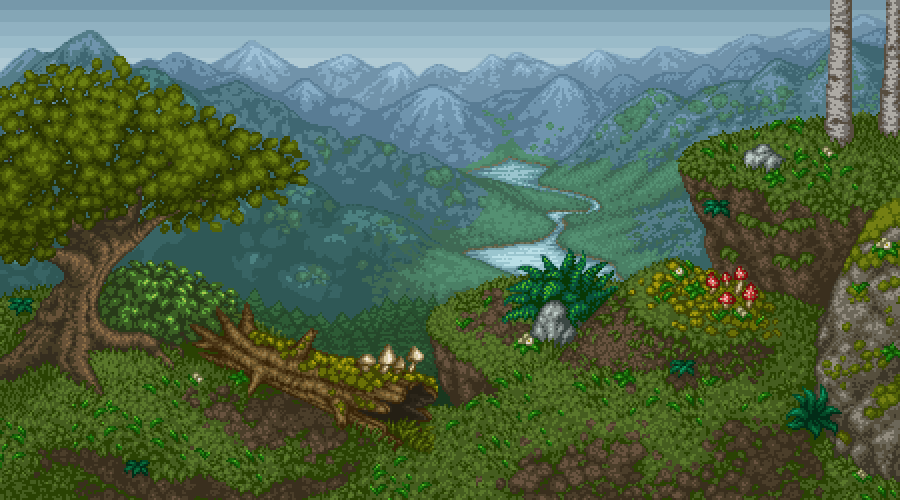 |
|
|
|
|
Logged
|
|
|
|
|
jakten
|
|
« Reply #28894 on: January 05, 2015, 08:25:02 AM » |
|
|
|
|
|
|
Logged
|
|
|
|
|
Rat Casket
|
|
« Reply #28895 on: January 05, 2015, 08:34:07 AM » |
|
2gd. followed on twitter. A+. you go girl. |
|
|
|
|
Logged
|
|
|
|
|
SeanNoonan
|
|
« Reply #28896 on: January 05, 2015, 12:34:42 PM » |
|
@Sean - Pretty cool. Did you trace over an existing Metal Slug sprite, or sprite it from hand using the originals as a kind of "goal" in terms of proportions?
A mix, I basically took three of the character sprites, took the bits I liked, recoloured, shoved them together, then reworked. I think I ended up with something a little too close to the default character (the one with shades) - if I ever went back to rework it any (for animating) I'd probably thin up the jeans a bit, shrink the shoes and maybe tighten the wrists on the jacket. That's if I use that character for my next prototype (something I have been thinking about). |
|
|
|
|
Logged
|
|
|
|
|
Canned Turkey
Guest
|
|
« Reply #28897 on: January 05, 2015, 08:38:24 PM » |
|
|
|
|
|
|
Logged
|
|
|
|
|
Sazem
|
|
« Reply #28898 on: January 06, 2015, 03:44:19 AM » |
|
BBreakfast, really nice environment..! :O really reminds me of childhood with those point and click adventure games.. Especially Simon The Sorcerer. That landscape has also bit lord of the rings feel I just couldnt wait to see some dwarfs and mage walking into the scene and start talking with some pixel font :D |
|
|
|
|
Logged
|
|
|
|
|
08--n7.r6-79.84
|
|
« Reply #28899 on: January 07, 2015, 04:10:27 AM » |
|
 pew-pew |
|
|
|
|
Logged
|
|
|
|
|
 Developer
