|
Maud'Dib Atreides
|
 |
« Reply #320 on: August 05, 2012, 05:35:03 PM » |
|
So I changed the color of the guard to a more obvious purple, since my bro said that he found it a bit difficult to keep track of them, which made sense. Now it shouldn't be hard to spot them at all. They also now have a little light around them in the dark, again making them easier to spot.  I also implemented the dark water as a hazard - fall in, and you'll lose 20 health and re-spawn at the last position that was safe. This will probably cause a bug later if I ever have moving platforms where you can fall into the water, but I'll cross that bridge when I get there. sexy, reminds me of the LoZ Oracle of Ages/Time deal where you'd see Link sunken underwater and then respawned back at the last patch of dry land he stood at before entering the water this may be strange, but have you ever considered doing remakes for the old LoZ games? I know there's no money in it, but I'd love you forever for doing it. Plus over 50 thousand fanboys and fangirls No pressure |
|
|
|
|
 Logged
|
Guy: Give me all of your money.
Chap: You can't talk to me that way, I'M BRITISH!
Guy: Well, You can't talk to me that way, I'm brutish.
Chap: Somebody help me, I'm about to lose 300 pounds!
Guy: Why's that a bad thing?
Chap: I'M BRITISH.
|
|
|
|
SolarLune
|
|
« Reply #321 on: August 07, 2012, 07:18:13 PM » |
|
@DustyDrake - I suppose that means I'm doing my job.  Not sure if I'll work on Dungens now, but I do like the idea and want to work on it. @Kinasin - Thanks! @#Sharp - Hah, yeah, that's where I got the idea from. I haven't considered doing remakes for LoZ games in particular, but I have considered making remakes of games in general. There are loads of games that deserve remakes that had genuinely interesting and cool mechanics and storylines that didn't quite work out well. I would love to try to remake / 'retry' some of them, in a way. But hey, maybe this or sequels to it will be better than the portable Zeldas! (It won't, but I'll try.) ---------------------------------  Recently, I've been: - Working on the mechanics for a new item.
- Thinking about retooling the storyline to fit better. It's kind of awkward the way it is now, and I want it to be deeper than a simple 'attack the invaders' story. I have to really think it through, probably eliminating most of what I have (though the nine lines of dialogue I've implemented into the game is fine, heh).
- Working on the BGM, trying my hand at some high-energy boss music. Didn't work out too well initially, but now I've got something that might be alright. I'll post the WIP of it sometime, probably soon.
An update video / trailer / demo / something should come around soon. |
|
|
|
|
Logged
|
|
|
|
|
clockwrk_routine
Guest
|
|
« Reply #322 on: August 07, 2012, 07:46:46 PM » |
|
I dunno if I said this before, but somehow I think if instead of using blender's lighting system, it would be better to pixel the shading in the textures.
|
|
|
|
|
Logged
|
|
|
|
|
SolarLune
|
|
« Reply #323 on: August 07, 2012, 10:00:00 PM » |
|
I dunno if I said this before, but somehow I think if instead of using blender's lighting system, it would be better to pixel the shading in the textures.
You might be right. I just did a quick attempt. The pic in the previous post shows the normal lighting effect.  In the above pic, the left side is without any lighting from the BGE, and is just with some simple darker tiles that I pixelled. I like the effect more than the base BGE lighting, but the front and side of the bricks are the same color, and the front of the map, where the grass comes down is too flat. I would have to draw lighting for both sides for all tiles, which could be good or bad. The right is with both a darker tile and the BGE lighting, which looks alright. |
|
|
|
|
Logged
|
|
|
|
|
DustyDrake
|
|
« Reply #324 on: August 08, 2012, 01:28:54 AM » |
|
The right on seems a bit much on the sides, but could work if the side tiles are lightened a hair.
|
|
|
|
|
Logged
|
|
|
|
|
Maud'Dib Atreides
|
|
« Reply #325 on: August 08, 2012, 08:27:18 AM » |
|
@DustyDrake - I suppose that means I'm doing my job. Not sure if I'll work on Dungens now, but I do like the idea and want to work on it. @Kinasin - Thanks! @#Sharp - Hah, yeah, that's where I got the idea from. I haven't considered doing remakes for LoZ games in particular, but I have considered making remakes of games in general. There are loads of games that deserve remakes that had genuinely interesting and cool mechanics and storylines that didn't quite work out well. I would love to try to remake / 'retry' some of them, in a way. But hey, maybe this or sequels to it will be better than the portable Zeldas! (It won't, but I'll try.) --------------------------------- Recently, I've been: - Working on the mechanics for a new item.
- Thinking about retooling the storyline to fit better. It's kind of awkward the way it is now, and I want it to be deeper than a simple 'attack the invaders' story. I have to really think it through, probably eliminating most of what I have (though the nine lines of dialogue I've implemented into the game is fine, heh).
- Working on the BGM, trying my hand at some high-energy boss music. Didn't work out too well initially, but now I've got something that might be alright. I'll post the WIP of it sometime, probably soon.
An update video / trailer / demo / something should come around soon. nice lighting, probably the brightest cheery looking screenie I've ever seen. I really hope you're going to add some crazy challenging puzzles. The LoZ Oracle of Seasons did an amazing job at this in the final temple with a puzzle where you had to push crates in a certain order to open a door. (I'm sure it's on YT if you're considering it) seriously, I hope you add some mental challenge in combination to the brute force shooting and running :D |
|
|
|
|
Logged
|
Guy: Give me all of your money.
Chap: You can't talk to me that way, I'M BRITISH!
Guy: Well, You can't talk to me that way, I'm brutish.
Chap: Somebody help me, I'm about to lose 300 pounds!
Guy: Why's that a bad thing?
Chap: I'M BRITISH.
|
|
|
|
clockwrk_routine
Guest
|
|
« Reply #326 on: August 08, 2012, 11:00:28 AM » |
|
mmm I like the left, it seems like some of your objects don't react to the lighting system like those door pillars, so they standout and I don't know if that's intentionally, like watching old cartoons objects that are going to be animated are much brighter and less painterly. It feels more consistent, but I can understand it being more work. You're palette really sticks out to me in that scene. There are a lot of vibrant and distracting colors going on, I kind of wish the colors would be more uniform in different environments like the swamp for instance it leans towards a purple and so everything draws together. I think the colors could be tone down, the color of those door pillars are particularly nice to me, they are soft on the eyes, compared to the saturated green. here I adjusted the colors a bit:  I reused the green in the doors for the grass, and road and sidewalk. the thing to notice is how mush less the colors burn your eyes, and how much your eye is drawn to the player rather than the environment. You don't have to go with those colors obviously but something to consider, I think the environment feels less disjointed. |
|
|
|
|
Logged
|
|
|
|
|
SolarLune
|
|
« Reply #327 on: August 08, 2012, 10:44:38 PM » |
|
@#sharp - There should be some puzzles, both the 'sit down and think' kind, as well as the 'think on your feet' kind.
@minnow - I see. I'm not a fan of the colors, but your edit is consistent and ties together better than the current state of things. I think I see what you mean and how I could improve - I'll see about changing the palette around a bit and trying to unify the colors in each scene.
I really wanted the colors to pop and be vibrant - it's not a 'post-apocalyptic game'. Even if that were the setting, I'd think that there should still be some color. It shouldn't just be gray or brown, and that's what I want to get across in my games. I guess it's a bit distracting, though, so I'll see about changing the colors around.
|
|
|
|
|
Logged
|
|
|
|
|
SolarLune
|
|
« Reply #328 on: August 09, 2012, 06:53:01 AM » |
|
- Worked on the colors.
- Worked on the new item more.
Okay, so here's where I try a different color scheme.  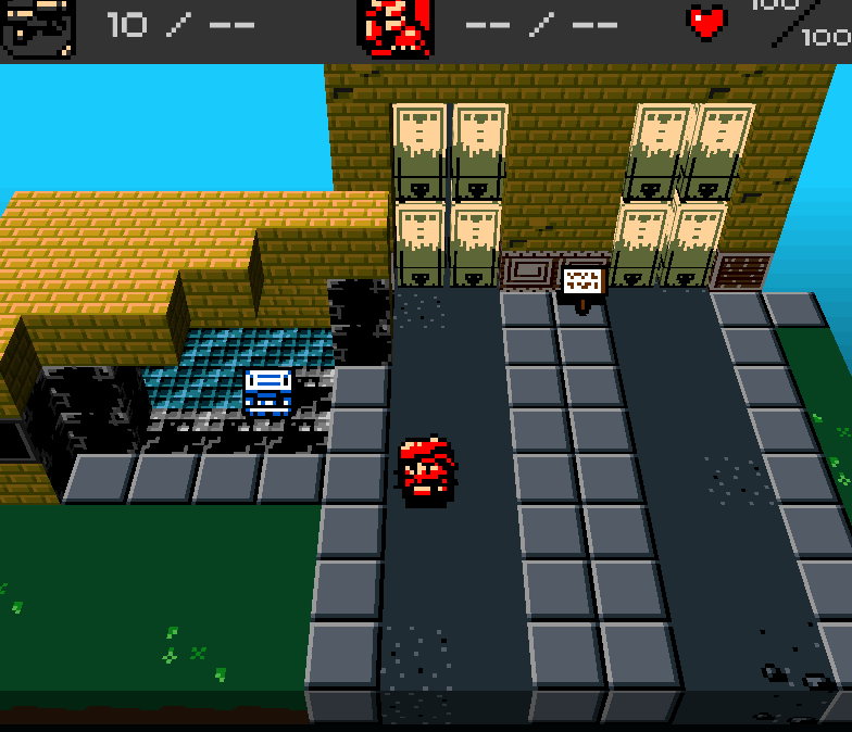 I'm also trying to make the ground tiles darker overall, so that they don't pop out as 'wall' tiles. Better or worse? I'm not a huge fan of the colors, but if it ties together better, then I guess it's a step in the right direction. Maybe I should just go with darker 'plain' colors? I mean, like what I had before, but just a bit darker and less saturated overall to make them less distracting? |
|
|
|
|
Logged
|
|
|
|
|
clockwrk_routine
Guest
|
|
« Reply #329 on: August 09, 2012, 08:00:05 AM » |
|
I like parts of what you have going on in the first screenie, I don't like the second one as much, it feels muddy. I like the tar,dirt,and cement of those road blocks.
Your bricks, the contrast between the colors seems different from the contrast between say the colors in your road blocks or the colors on the ground or your character. Those environment objects fit really well together, while your buildings seemed like they're blurred against it.
I would look at the colors you are using for the tar,road blocks, dirt, and your hero. Those sit really really well together, so I don't know if it's actually the saturation level (sorry), but keeping the contrast between colors at the same level, and keeping it stylistically similar.
And maybe the lighting system, the shadows, are actually fungling up the contrast levels on the colors, that's what it looks like.
I would love to muck around with those textures and figure out what's off to me. If you want to send them that would be great, but otherwise I'll mix up a similar scene and we can do some comparisons.
Sorry if my last advice was off.
|
|
|
|
|
Logged
|
|
|
|
|
clockwrk_routine
Guest
|
|
« Reply #330 on: August 09, 2012, 08:46:04 PM » |
|
so mucked around:  The shadows are planes placed on the ground and on adjacent objects. I made the far left wall straight black. I think it would help to unify your environments, you use shadows in several different ways, gradient alphas, straight black, and the blender light engine. I think it feels collage-e which was throwing me off. keeping a level of contrast and avoiding gradual gradients if possible. For instance your lighting here:  instead of anti-aliasing along the edge, maybe just a single wide solid band separating shadow and light. Also for textures, I would use the same colors, for the top, front side, right side, but use more of the brightest color on the top, and less so on the front and right side (which could probably be the same texture and look great) sorry if my advice comes too late. I think your project looks and feels great as is, I'm just nitpicking. |
|
|
|
|
Logged
|
|
|
|
|
SolarLune
|
|
« Reply #331 on: August 09, 2012, 11:21:41 PM » |
|
@minnow - No, no, thanks a lot for the advice. It's always good to get more in-depth advice like yours as opposed to "the graphics aren't consistent." Thanks for the example, too - I like the way it looks, and I would like to have some cool shadows (especially dynamic). Maybe I could implement that into the game somehow, or at least try the method you've got with your black planes. And thanks for the complement - I hope I can keep it looking good / make it look better.  --------------------------------------------------- - Continued to fuss about with the colors.
That's all that I did today, but I also am trying out colored outlines (visible only on the player and the enemy) and using less colors on the circular light spots. I like the colored outlines - I think they offset nicely against the black shadows and darker level.  (Sorry for that image; thought I cropped it. Too lazy to go back to fix it.)   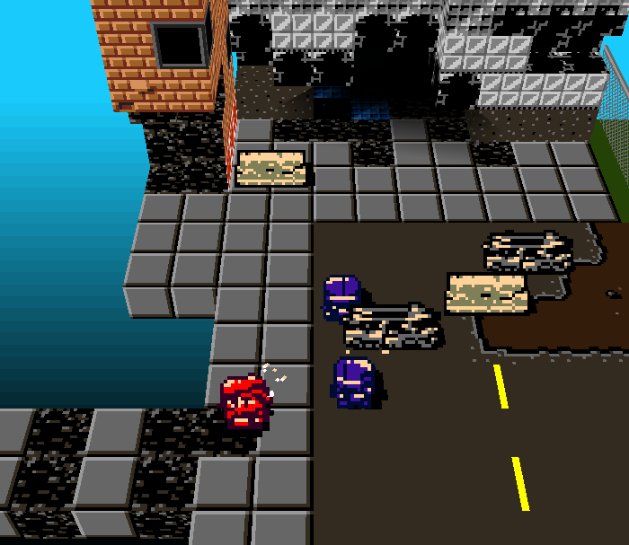 I think I'm going to change the white to gray at the bottom of the gate, but I like the way it's turning out. Oh, and I haven't taken off Blender's normal lighting yet for everything - some objects are still illuminated in those screens, I think. |
|
|
|
« Last Edit: August 09, 2012, 11:37:02 PM by SolarLune »
|
Logged
|
|
|
|
|
clockwrk_routine
Guest
|
|
« Reply #332 on: August 10, 2012, 09:00:25 AM » |
|
thumbs looks great! I would darken the colored outlines
those sidewalks are a bit garish, more texture like your cement road block
|
|
|
|
« Last Edit: August 10, 2012, 09:16:12 AM by minnow »
|
Logged
|
|
|
|
|
Udderdude
|
|
« Reply #333 on: August 10, 2012, 09:04:20 AM » |
|
Are you planning to add any way to get to the higher elevations? It would be nice if there were elevators or something.
Sorry if these are already in the game and I missed them somehow.
|
|
|
|
|
Logged
|
|
|
|
|
SolarLune
|
|
« Reply #334 on: August 11, 2012, 09:34:37 PM » |
|
@Udderdude - You mean like just on top of the buildings in the map, or skyscraper area? If the latter, you'll just have to wait and see. :D @minnow - Thanks for your feedback! I think the outlines might be a bit too bright, yeah. It's particularly noticeable in the filtered shot below, but this is a pretty good step forward from the previous graphical state. I didn't see your sidewalk part until now. I think I see what you mean by garish - it's a little plain. Maybe I'll make it less 'segmented'. Thanks again! --------------------------------------------- I'm trying to resist refactoring my code, as while it's completely functional right now, I'm pretty sure it's horrible. I'm also positive that refactoring probably won't give any speed benefits, so it won't even be really worth it. I guess I'll just save it for the next game.  So in addition to pixelling another car and building up the map below a bit, I also added a little additive filter on top of the screen if you're on a daylight map. Filtered: 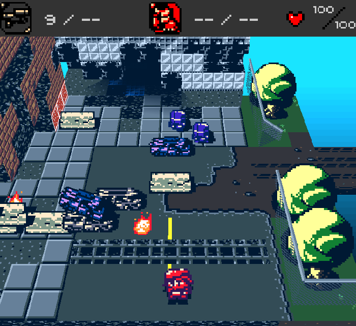 Unfiltered: 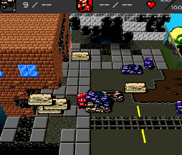 Also:  I probably should clean that up a bit, but still, I'm pretty happy with it. It was made with Blender too! :D |
|
|
|
« Last Edit: August 11, 2012, 09:55:39 PM by SolarLune »
|
Logged
|
|
|
|
|
DustyDrake
|
|
« Reply #335 on: August 11, 2012, 09:38:07 PM » |
|
Hm, I just noticed something that's bothering me.
Is there any way to get the sprites to not be perfectly parallel with the screen all the time, like as an option or something?
The way the button sticks off of the wall 4 screens up bothers me.
|
|
|
|
|
Logged
|
|
|
|
|
clockwrk_routine
Guest
|
|
« Reply #336 on: August 11, 2012, 11:34:59 PM » |
|
@dusty d That would make the pixels squashed and rectangular. He could up the angle and draw it again, showing more of the top and less of the button's face. Though it might be nice to model it instead(?).
logos got crunch I like it.
where the grates meet the road and where the grass meets the dirt maybe some kind of transition, like how the road meets the dirt.
|
|
|
|
|
Logged
|
|
|
|
|
DustyDrake
|
|
« Reply #337 on: August 11, 2012, 11:46:27 PM » |
|
Well, I was thinking making the sprites align with perspective, like the walls do.
|
|
|
|
|
Logged
|
|
|
|
|
Graham-
|
|
« Reply #338 on: August 12, 2012, 12:02:44 AM » |
|
Watched devlog video for the first time. I like the pace of your game. I remember some designs I did with a similar perspective, and all this level browsing and back-tracking, but more of a focus on drawn-out multi-room battles and physical combat.
The best part about these kinds of games is owning an environment, fast gameplay etc.
I would shorten the text. 6-page things break the game's pace. If you want to put some color text in I'd spread it out. You can pop that stuff up anywhere.
|
|
|
|
|
Logged
|
|
|
|
|
Maud'Dib Atreides
|
|
« Reply #339 on: August 12, 2012, 06:51:55 AM » |
|
@Udderdude - You mean like just on top of the buildings in the map, or skyscraper area? If the latter, you'll just have to wait and see. :D @minnow - Thanks for your feedback! I think the outlines might be a bit too bright, yeah. It's particularly noticeable in the filtered shot below, but this is a pretty good step forward from the previous graphical state. I didn't see your sidewalk part until now. I think I see what you mean by garish - it's a little plain. Maybe I'll make it less 'segmented'. Thanks again! --------------------------------------------- I'm trying to resist refactoring my code, as while it's completely functional right now, I'm pretty sure it's horrible. I'm also positive that refactoring probably won't give any speed benefits, so it won't even be really worth it. I guess I'll just save it for the next game. So in addition to pixelling another car and building up the map below a bit, I also added a little additive filter on top of the screen if you're on a daylight map. Filtered: Unfiltered: Also: I probably should clean that up a bit, but still, I'm pretty happy with it. It was made with Blender too! :D Awesome logo. I take it from the style of your logo that the pixelated style that you use to make games will permanently be your game development style? It fits |
|
|
|
|
Logged
|
Guy: Give me all of your money.
Chap: You can't talk to me that way, I'M BRITISH!
Guy: Well, You can't talk to me that way, I'm brutish.
Chap: Somebody help me, I'm about to lose 300 pounds!
Guy: Why's that a bad thing?
Chap: I'M BRITISH.
|
|
|
|
 Community
