Tattie-Bogal
Level 0

Your starchiest pal.

|
 |
« Reply #11340 on: April 29, 2016, 02:55:39 AM » |
|
Just some doodles I did  Good jack and daxter vibes right here. |
|
|
|
|
 Logged
|
|
|
|
|
BBreakfast
|
|
« Reply #11341 on: April 29, 2016, 08:09:05 AM » |
|
 WIP |
|
|
|
|
Logged
|
|
|
|
|
ProgramGamer
|
|
« Reply #11342 on: April 29, 2016, 12:28:47 PM » |
|
Why do you draw on such a dark background color? Is it to emulate paper better, because if that's the case I'll take the hint and do that as well.
|
|
|
|
|
Logged
|
|
|
|
|
BBreakfast
|
|
« Reply #11343 on: April 29, 2016, 12:59:12 PM » |
|
Are you asking me, or Demon Lizardman?
I just chose a subtle bg color that was easy on my eyes and matched the value of our textbox color fairly closely so i know roughly how it will look in the game.
|
|
|
|
|
Logged
|
|
|
|
|
ProgramGamer
|
|
« Reply #11344 on: April 29, 2016, 01:02:39 PM » |
|
I was asking you, yeah, though I guess the question applies to both of you.
I just never really thought to change the background color in the programs that I use to make art, so it caught my eye.
|
|
|
|
|
Logged
|
|
|
|
Lee
Level 1

|
|
« Reply #11345 on: April 29, 2016, 01:13:58 PM » |
|
The stark white lit screen can skew your colour perception and it's always difficult to judge colour when there is no nearby colour to compare against. From a full white you might be influenced toward picking brighter colours, as dark colours will have extreme contrast in comparison. More experienced artist may be able to overcome this by relying more on memory/experience/colour theory, but using a mid-tone can help a lot.
There's also the fact that you can immediately start using bright highlights or use a white outline to make your drawing "pop out" which can be a nice visual effect.
It can also help you by giving a colour reference for a scene or grouping of objects so that nothing seems out of place if you were to use it in a project.
|
|
|
|
|
Logged
|
|
|
|
|
gimymblert
|
|
« Reply #11346 on: April 29, 2016, 01:26:48 PM » |
|
Yep it's pretty good practice to start with a neutral background (50% gray) when you do color, in art schools they sometimes makes buy non white paper (mine did). You will see a lot of pro use those brown tone sketch books and draw light on them with white pencil.  |
|
|
|
|
Logged
|
|
|
|
|
|
|
maruki
|
|
« Reply #11348 on: April 30, 2016, 06:06:30 PM » |
|
My team decided that our LD#35 game was worth further development, so I made a simple concept for it:  |
|
|
|
|
Logged
|
|
|
|
|
andes-neumann
|
|
« Reply #11349 on: April 30, 2016, 06:27:36 PM » |
|
Did some HLD fanart recently  |
|
|
|
|
Logged
|
|
|
|
|
|
|
Qoelet
|
|
« Reply #11351 on: May 04, 2016, 09:35:59 AM » |
|
|
|
|
|
|
Logged
|
|
|
|
swordofkings128
Level 6

|
|
« Reply #11352 on: May 04, 2016, 05:03:13 PM » |
|
WIP  I've been seeing your most recent stuff on here and you've gotten pretty good! I think I recall seeing the first things you put on tigsource and it's such a difference. A side note, I really dig this squirrel thing you got going on, it has a certain... Like early to mid 2000s platformer character look to it. I love it! Hope you make a sweet platformer game out of your squirrel people stuff you've been showing us. |
|
|
|
|
Logged
|
|
|
|
|
|
|
DireLogomachist
|
|
« Reply #11354 on: May 04, 2016, 08:59:24 PM » |
|
I humbly request a Conker's Bad Fur Day crossover post |
|
|
|
|
Logged
|
 Living and dying by Hanlon's Razor |
|
|
|
|
|
BBreakfast
|
|
« Reply #11356 on: May 05, 2016, 08:30:54 AM » |
|
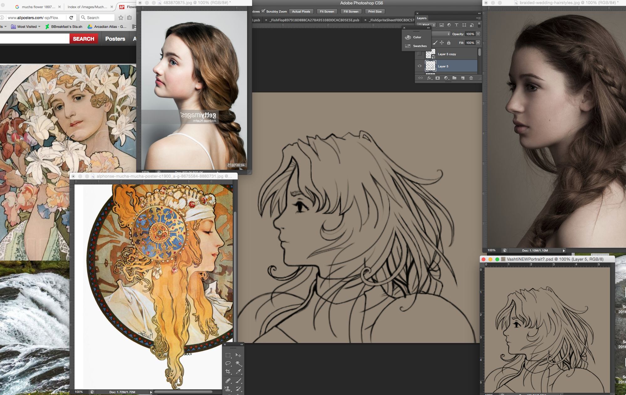
 almost done with line art |
|
|
|
|
Logged
|
|
|
|
|
Zorg
|
|
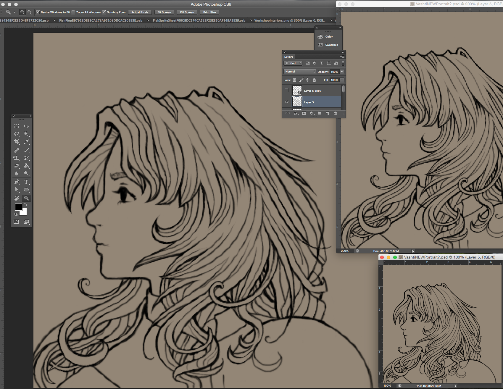
« Reply #11357 on: May 05, 2016, 08:38:23 AM » |
|
Do you directly work at the final resolution?
|
|
|
|
|
Logged
|
|
|
|
|
|
|
BBreakfast
|
|
« Reply #11359 on: May 06, 2016, 07:03:44 AM » |
|
Thanks zilluss! Love me some art nouveau.
zorg: yup I do, the 100% zoom window in the bottom left is what it actually looks like at regular size, I just like to zoom in close and get the lines looking nice and clean.
|
|
|
|
|
Logged
|
|
|
|
|
 Developer
