|
Lux
|
 |
« Reply #28560 on: November 19, 2014, 05:54:02 AM » |
|
Grassy field.. I have a lot of grassy variety in my Large open world 2D action rpg game..  Some of the best grass tiles I've seen in a long time! |
|
|
|
|
 Logged
|
|
|
|
|
Storsorgen
|
|
« Reply #28561 on: November 19, 2014, 09:14:35 AM » |
|
Those are nice beetleking, but I think I liked it when the grass itself was less noisy and had more "blank" space.
|
|
|
|
|
Logged
|
|
|
|
|
beetleking22
|
|
« Reply #28562 on: November 19, 2014, 10:53:50 AM » |
|
Those are nice beetleking, but I think I liked it when the grass itself was less noisy and had more "blank" space.
Thank you lez and Strosorgen... I want make big areas so it would be boring if the whole space is just blank grass... Thats why I wantend to make more variety for bigger areas.. Im combining both.. |
|
|
|
|
Logged
|
|
|
|
|
Kingel
|
|
« Reply #28563 on: November 19, 2014, 11:02:32 AM » |
|
The contrast already has improved a lot compared to your previous stuff here (and IIRC contrast and palette issues were really the only issues your work had to begin with). Got a new screen, or did you find a way to calibrate the old one?
I've gotten better at reminding myself to crank up the contrast. The monitor I use for pixeling is pretty good. I'm just used to viewing a cheap, washed-out laptop screen for everything else. The nice thing about limited palettes is that it's easy to tweak the colors, at least.  Grassy field..
The random placement of grass and flowers makes it look a lot more natural. Are you using tiles for this at all? I can't see a grid that fits anything other than the path. |
|
|
|
|
Logged
|
|
|
|
|
beetleking22
|
|
« Reply #28564 on: November 19, 2014, 11:53:01 AM » |
|
The contrast already has improved a lot compared to your previous stuff here (and IIRC contrast and palette issues were really the only issues your work had to begin with). Got a new screen, or did you find a way to calibrate the old one?
I've gotten better at reminding myself to crank up the contrast. The monitor I use for pixeling is pretty good. I'm just used to viewing a cheap, washed-out laptop screen for everything else. The nice thing about limited palettes is that it's easy to tweak the colors, at least. Grassy field..
The random placement of grass and flowers makes it look a lot more natural. Are you using tiles for this at all? I can't see a grid that fits anything other than the path. BTW your forest scene looks Amazing... Im not using tiles.. It looks too limited with tiles.. I dont like use them anymore... I have a lot of grass variety that its going to fill the repetitiveness of the grass. Some areas are going to be large and its not going to look too noisy.. |
|
|
|
« Last Edit: November 22, 2014, 09:23:07 AM by beetleking22 »
|
Logged
|
|
|
|
|
shellbot
Guest
|
|
« Reply #28565 on: November 20, 2014, 12:16:57 AM » |
|
A wip of one of the bosses for my game  |
|
|
|
|
Logged
|
|
|
|
|
Skippi
|
|
« Reply #28566 on: November 20, 2014, 07:35:07 AM » |
|
Some art progress.  Good Job Dude! |
|
|
|
|
Logged
|
|
|
|
|
Landshark RAWR
|
|
« Reply #28567 on: November 20, 2014, 04:45:42 PM » |
|
 colours pulled from original marshtop sprite |
|
|
|
|
Logged
|
|
|
|
|
Ingenoire
|
|
« Reply #28568 on: November 21, 2014, 03:34:10 PM » |
|
 So I decided to give a (temporary?) title to my game, and I went ahead and started making a title screen along with a logo. Tried making a zoomed-in leaf in the background. So I messed up the layering and tried to fix it, but I hid one layer and got...  ...something ressembling Metroid Prime's title screen with vegetation instead. Maybe I should just edit this one... |
|
|
|
|
Logged
|
|
|
|
|
vaaasm
|
|
« Reply #28569 on: November 21, 2014, 05:47:29 PM » |
|
colours pulled from original marshtop sprite really neat! I like the stylish shine effect although, I think the shine's fluid animation makes the marshtop look a bit stiff
  made a new avatar of crystal head person |
|
|
|
|
Logged
|
|
|
|
|
Storsorgen
|
|
« Reply #28570 on: November 22, 2014, 08:23:37 AM » |
|
 Attack animation for the player in my current game project. In the game there is alpha channel fading on the hammer-trace on the last two frames. |
|
|
|
|
Logged
|
|
|
|
|
JobLeonard
|
|
« Reply #28571 on: November 22, 2014, 09:32:06 AM » |
|
Might work better if the first frame shows a half-unfinished arc? It just kind of appears now.
|
|
|
|
|
Logged
|
|
|
|
|
Cellusious
|
|
« Reply #28572 on: November 22, 2014, 10:56:01 AM » |
|
|
|
|
|
|
Logged
|
|
|
|
Eendhoorn
Level 6

Quak

|
|
« Reply #28573 on: November 22, 2014, 11:43:52 AM » |
|
This is for my IndiesvsPewdiepie game.  The character is looking kinda dull combined with this tileset. I just have no clue what to do with the colours. When I change the background to blue it gets even worse.  The game is actually unplayable like this :p  I'm trying to stick to an NES palette, but have already made an exception for the brown in the tiles. Any suggestions? |
|
|
|
|
Logged
|
|
|
|
|
Landshark RAWR
|
|
« Reply #28574 on: November 22, 2014, 06:14:47 PM » |
|
 it's been a while since I animated this character |
|
|
|
|
Logged
|
|
|
|
|
|
|
SolarLune
|
|
« Reply #28576 on: November 22, 2014, 10:00:16 PM » |
|
@omg - Use darker colors if your background's gonna be bright. I'd probably not go with pure white for the hair and eyes - they're hard to see against the background.
You could also add an outline to help make it easier to see.
You could also try simplifying your shapes or reposing the character to make its details easier to make out.
At that resolution - heck, at any resolution, readability is super important. Make it readable first and fore-most, and then make it look good.
@Landshark - Nice, smooth animation. I think they should bob up and down a bit, but otherwise, it's really nice.
@thephfactor - Hm, that's interesting. Nice dark, sullen feel, though I think it lacks contrast.
|
|
|
|
|
Logged
|
|
|
|
|
Raku
|
|
« Reply #28577 on: November 23, 2014, 06:45:21 AM » |
|
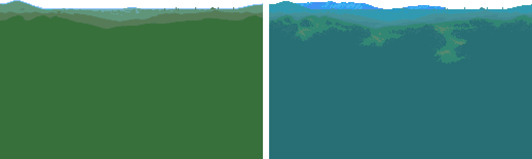 first draft on the left, current update on the right |
|
|
|
|
Logged
|
|
|
|
|
Cobralad
|
|
« Reply #28578 on: November 23, 2014, 08:49:37 AM » |
|
foreground for context
|
|
|
|
|
Logged
|
|
|
|
|
|
|
 Developer
