|
iggie
|
 |
« on: September 12, 2009, 11:46:20 AM » |
|
Hi,
I am driving myself nuts trying to design a good looking GUI for a RPG/Strategy hybrid game. There are so many ugly GUIs out there I am even confused as to what makes the good ones look good.
I guess GUI design draws on graphic design and print layout skills, as well as general artistic skill - but I could do with some ideas or tutorials towards making a good looking and well functioning GUI for my game.
Some of the really popular commercial games go for a fairly minimal gui - handling a lot of the work in text tables, and menus rather than trying to make everything a graphical button. And I love FinalFantasy which has an almost childishly simple text GUI for a lot of the gameplay.
I don't really want to hear 'the best GUI is no GUI' because although it is true I think it is an unreasonable restriction to put on a Strategy/RPG - eg: I think Black&White was too little GUI.
Any suggestions on really good RPG/Strategy GUIs?
|
|
|
|
|
 Logged
|
|
|
|
Theodolite
Level 0


|
|
« Reply #1 on: September 12, 2009, 12:45:11 PM » |
|
I'd keep only the most important information on screen and give the option to hide/show gui elements however the player wanted.
|
|
|
|
|
Logged
|
|
|
|
|
Kekskiller
Guest
|
|
« Reply #2 on: September 12, 2009, 12:50:43 PM » |
|
I guess GUI design draws on graphic design and print layout skills, as well as general artistic skill Nope, good GUI design is experience with different good AND bad GUIs. I know, I know - this is redundant. But everytime I see a layout and/or design guy making a game GUI...  The art of GUIs is the art of knowing: a) what the player wants to see b) where he wants to see it and c) how the player he wants to see it Interface design is only design thing I think that would be useful, since every game is a product the user has to use. Rememer you're designing something that has to be useful for the player, no the concepter or programmer. Concept GUIs suck. Only if your concept get's tested, reworked, reimproved, etc. it get's a real GUI - look at Apple guys. Or legendary synthesizer interfaces. Good stuff, simple stuff. PROVEN stuff. Strategy games tend to have messy layouts. The game with the best strategy GUI I ever used was Paraworld. Not because of the colors or icons (which are generally HORRIBLE in strategy games, due to the high amount of informations and different actions) but because of the unit manager. The idea is simple: List every possible unit you can have and display 'em in several 2D arrays, an array for each unit level. You could level up your dinosaurs, so keeping the overwiev how strong your dinosaurs are was solved really good in this game. You could select, command and dragdrop you units, a very useful idea. Unfortunately, the strategy game community was to l33t for good GUIs, so they insisted on their stupid warcraft-esque layout which is comparable with typewrite. I don't know what your strategy will going to be, but keep in my mind what is essential for the gameplay, not the eye candy. Things to keep in mind: - visibility - accessibility - colours So, for a strategy game I suggest (depends on how important it is for the gameplay) a more numberless display. I know, I know - strategy games usually require a lot of numbers for exact comparison, but it can be done otherwise. Like using progress bars for a quick overview, red to yellow to green colors for immediate quality lookups or so. Don't use to much details in your GUI - the simpler, the more user-friendly. Essential interface design, focussing only on important parts. Even a simple rectangle does a better job of telling the player how dead he is than a giant rose-covered circular thingie. It may look better, but it will not be as effective as a simple design. That's my experience. |
|
|
|
|
Logged
|
|
|
|
|
iggie
|
|
« Reply #3 on: September 13, 2009, 02:34:32 AM » |
|
Thankyou! It is easier to understand other GUI's and design my own with a few key concepts to bear in mind. I'll let you see how I get on  |
|
|
|
|
Logged
|
|
|
|
|
Bree
|
|
« Reply #4 on: September 13, 2009, 08:27:57 AM » |
|
One GUI I would highly recommend studying is Team Fortress 2's: 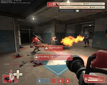 Just take a look at all the info the screen has crammed on it. Just from a quick glance once can get all of the most vital info he needs- the health bar is always one of the biggest icons, and gets progressively redder as the player is closer to death. Human eyes are intensely attracted to the color red, making the player constantly aware of their vitality. On the subject of red, you'll also notice that the red icons are not overly saturated- this identifies their proper team without needlessly distracting the player. The art style does help- after all, the character silhouettes are practically a GUI in and of itself. But these are just my two cents. |
|
|
|
|
Logged
|
|
|
|
|
Trevor Dunbar
|
|
« Reply #5 on: September 13, 2009, 04:03:51 PM » |
|
Just rip-off warcraft 3! Solved. I'm a genius.
|
|
|
|
|
Logged
|
Toucantastic.
|
|
|
|
Afinostux
|
|
« Reply #6 on: September 14, 2009, 07:23:00 PM » |
|
I like wheel menus and that cool pie thing crysis did. Not enough games do those/that.
|
|
|
|
|
Logged
|
|
|
|
|
iggie
|
|
« Reply #7 on: September 15, 2009, 12:02:54 AM » |
|
I am thinking of keeping the 'always on' part of the GUI very minimal, and putting the more complex screens on popup windows.
For actions on the 3D world it will be left click to select, right click for default action, and hold right button to open a context menu (somehow with nested submenus). Perhaps that is a bit like the Crysis pie?
|
|
|
|
|
Logged
|
|
|
|
|
nihilocrat
|
|
« Reply #8 on: September 17, 2009, 05:46:54 PM » |
|
I liked the System Shock 2 GUI: 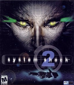  Not an example of perfection or anything, but it felt really natural after playing the game for quite awhile. Deus Ex, for example, felt more stifling because it took up the whole screen when you went into inventory mode.  However, I think Out of This World's GUI is the best.  See what I did there? The game felt a lot more cinematic because a) there was no GUI and b) there was no scrolling. |
|
|
|
« Last Edit: September 17, 2009, 05:52:08 PM by nihilocrat »
|
Logged
|
|
|
|
|
Kekskiller
Guest
|
|
« Reply #9 on: September 18, 2009, 01:10:01 AM » |
|
Talking about Deus Ex, I really liked the GUI of Deus Ex 2: Invisible War  It's some kind of a ring menu, I really like the look. Felt always smooth and not too rucksack-like. Also, the Perfect Dark GUI is GREAT:  The red rectangle turns yellow if the secondary weapon function is activated, the upper green bar represents clipped ammo, the lower blue is the not-clipped ammunition. Voila! Health is onely visible after a hit, since even a 5 hits in the chest will take you down immediately (it's a game about secret agents, I think this is OK). So lovely  . The weapon selection was similar to a ring menu, instead of going up and down you just had to aim an item with the joystick. |
|
|
|
|
Logged
|
|
|
|
|
iggie
|
|
« Reply #10 on: September 18, 2009, 06:15:06 AM » |
|
Interesting choice to keep the main 3D window visible in System Shock 2. Depends on how big the inventory gets.
I've also been wondering whether to do the small square pictures for my items, or just have a little type icon next to a text name. There is a fair bit of trading & collecting in my game and you have medium sized squads of characters to equip - as well as being able to add equipment to buildings and vehicles.
I like FinalFantasy games and Trading games that just use text names for each item because they are clear to use and allow a lot of variety with little effort - but I think the square pictures are more fun to play with - especially if similar items can stack.
|
|
|
|
|
Logged
|
|
|
|
soundofsatellites
Level 2

no way baby, let's go!
|
|
« Reply #11 on: September 19, 2009, 12:12:31 PM » |
|
Interesting choice to keep the main 3D window visible in System Shock 2. Depends on how big the inventory gets. And it's needed as well. SS2 doesn't do such pussyish things as pausing the game when you're in inventory mode.  You can still walk around, but as far as I can remember you can't shoot or look up&down. no you can't. at first it seems clumsy, and then... it's still clumsy, but you get used to. I always find funny in ss2 that you can't aim, but your avatar's arm is still aiming (just picture a dude who's looking inside a bag searching for something with one hand, and is pointing a gun with the other... :D) but seriously... i'm with kekskiller in this. Just define exactly the gameplay you're going to have using a placeholder gui/debug info. How much RPG is there in comparison to strategy or viceversa? is it 1st person? 3rd? topdown? Is it turnbased or realtime? Only then you can remove the superflous elements and start making it all nice and shiny! You have out there a lot of GUIs done right like the warcraft ones, battlezone, etc. good luck! |
|
|
|
|
Logged
|
and the glitter is gone
|
|
|
|
iggie
|
|
« Reply #12 on: September 19, 2009, 01:23:47 PM » |
|
Just define exactly the gameplay you're going to have using a placeholder gui/debug info. The more I get into the GUI design, the more I am having to make these gameplay choices and really lock down on the details of how it will play. I think once I have a decent plan on paper of how the gameplay works in the variety of play modes the GUI should slot into place. Combat, WorldMap and Dialog are fairly straight forward modes to design. Inventory, Party Management (6 Heroes and 100+ Workers), and Trading are the trickier areas, along with Quest Management. But although they are tricky I think it will help my game fun if these elements work well. I am hoping to automate parts of Party and Trading, perhaps once you reach a certain skill level you can hire a Quartermaster and Merchant Trader to do a lot of the repeated boring actions in these areas while the Player concentrates on encounters and quests. |
|
|
|
|
Logged
|
|
|
|
|
Brice
|
|
« Reply #13 on: September 22, 2009, 10:24:40 PM » |
|
UI design is one of the most foundational aspects of a game and (luckily) also the easiest to test.
There are many UI style guidelines out there. You could check out Jakob Nielsen's site for one.
It you're itching to get going, however, my best advice would be to mock something up and throw it in front of a player who is new to the game. Watch over their shoulder and see what they do, and think of ways you can make it better. For example...
- Do they keep clicking on buttons across the screen from each other? Move them closer together.
- Point to a button/icon and ask them, "Do you know what this means?" If they say no, then that means you need to change it, because you didn't correctly convey to them what's going on.
- Do they keep clicking the same three-button sequence? Consider lumping those actions into one button.
And so on. If your game isn't ready to playtest, then you're probably too early to be thinking about the UI anyway.
Good luck!
|
|
|
|
|
Logged
|
|
|
|
|
undertech
Guest
|
|
« Reply #14 on: September 23, 2009, 11:17:56 PM » |
|
Gumps gumps gumps
|
|
|
|
|
Logged
|
|
|
|
|
iggie
|
|
« Reply #15 on: September 23, 2009, 11:40:02 PM » |
|
Brice: I found Jakob Nielsen impenetrable, just couldn't find any relevant content! I've read GUI theory about button location, size, location and such - my problem is more with the gameplay flow and graphic design. I've got a working prototype with placeholder GUI. I am trying to get the atmosphere and feel right, as well as coming up with good graphic designs for the border styles and buttons, as well as the font and icons. While I am fairly good at painting and 3D modeling it seems to be a rather different skill making all these pixel perfect 2D designs. Well I guess it is easier to discuss specifics than abstracts so I will be back with some of my designs for critique |
|
|
|
|
Logged
|
|
|
|
|
Brice
|
|
« Reply #16 on: September 25, 2009, 09:12:11 AM » |
|
As far as atmosphere, you'll probably want to make choices about how you want it to feel. Should it feel like a cockpit? Like the character is using the UI (deadspace)? Like there is no UI? This will drive a lot of your decisions.
Best of luck! We look forward to hearing back!
|
|
|
|
|
Logged
|
|
|
|
|
iggie
|
|
« Reply #17 on: September 25, 2009, 02:43:49 PM » |
|
I am aiming at "18th century merchant trading in central Asia" as a theme, although it blends into medieval Spice Trail and Silk Road at times! I am going to try for a tactile GUI, but trying not to be too literal. Here are some styles I am working on: 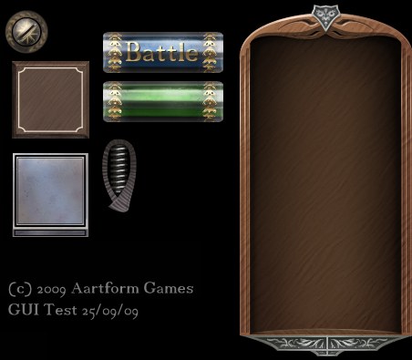 I want to add more of the carved metal designs to add variety to the frames, with different animal and plant motifs. As for layouts, I think I am going to try and keep a flat hierarchy - so when you are doing a certain task all the things you want to do are immediately visible with minimal/no submenus, and anything unrelated to the task at hand is hidden away. Also windows will happily expand to fill the whole screen when doing tasks like unit management/trading to give lots of room for the important info and no clutter. This goes against the trend for lots of little popup windows, but I think it is worth a go I am keeping in mind "What the player wants to see", "Where he wants to see it" and "How it should be displayed" as key design decisions. |
|
|
|
« Last Edit: October 06, 2009, 09:10:49 AM by iggie »
|
Logged
|
|
|
|
|
PsySal
|
|
« Reply #18 on: September 26, 2009, 06:55:05 AM » |
|
Here is my tips!
#1 priority should be usability. This is sometimes called "user friendliness" and sometimes called "intuitiveness". Forget about smooth looking graphics to start with, which could be form over function.
Read useit.com. It is a terribly-organized site with incredibly good advice for making usable software. Mostly it's focused on the web but you can learn lessons.
Playtest. Get somebody to use your UI and see what they do. It will surprise you. Don't give them clues but give them tasks like, "equip your red shield" and see what they do.
Organization. You need to think carefully about how your menus are organized. Will they be organized by task, or by item type, or action category? For a good example of how many different, confusing ways an RPG menu can be organized, see SaGa Frontier 2. I think you might be halfway through the game before you understand how most of the menus work.
Affordance is important to understand. Affordance means, when the user looks at your interface, is it obvious what they can click? On the web, this means making links underlined or in a different color. The other way to create affordance is with a "3D" look. If your UI looks flat except for buttons, which look 3D, the player will understand what they can click on.
Thar ye go!
UPDATE: Okay well I see other people have recommended Jakob Neilsen as well. He has really good ideas, but I think the main ones are summed up by my above points! Subscribe to his AlertBox newsletter...
|
|
|
|
|
Logged
|
|
|
|
|
iggie
|
|
« Reply #19 on: October 15, 2009, 11:50:45 PM » |
|
Thanks for all the ideas - I now have a useful checklist to help when designing GUI. 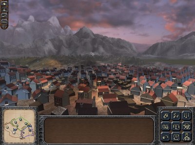 View Full Size View Full SizeI have mocked up the basic layout for the main screen, in the end it is not massively different to 100's other games. On balance I decided not to go for a context popup chooser, instead having the main buttons always visible for a given task (in bottom right), and these change when you are in different modes - eg: Map, Combat, Town Management. In the top left is the top level mode chooser, which can launch combat, economy stats, and the system menu. At the bottom in the middle is a dynamic inventory/chooser panel which will display equipment/characters/buildings depending on the task at hand. To in the bottom left is the world map, which can swap out to a local map when required. I am going to reuse these frames, and some more wooden style ones to mockup the rest of the more table/spreadsheet parts of the GUI eg: Inventory and Trade screens, then I can always smarten it up or add more custom graphics later once the GUI usability is on top form. |
|
|
|
|
Logged
|
|
|
|
|
 Community
